How to increase the mood of Coffee website Construction
For professional baristas, please follow the coffee workshop (Wechat official account cafe_style)
For coffee websites, how to achieve exquisite food and elegant environment docking, which for many website designers, is a more difficult step. Therefore, when we are designing a coffee website, we need to let strong coffee fill the site, which gives people a sense of lingering, and then arouses users' appetite and mood, so that users want to taste the aroma of coffee when they see the content of the site.
Therefore, we need to extend this coffee culture to the website to enrich the cultural connotation of coffee, so that different grades of users can find suitable coffee. Coffee website is not stereotyped, but really add emotional mood to the coffee. Next, Puyang website construction on how to increase feelings.
1. Create a plump and textured page in modern style
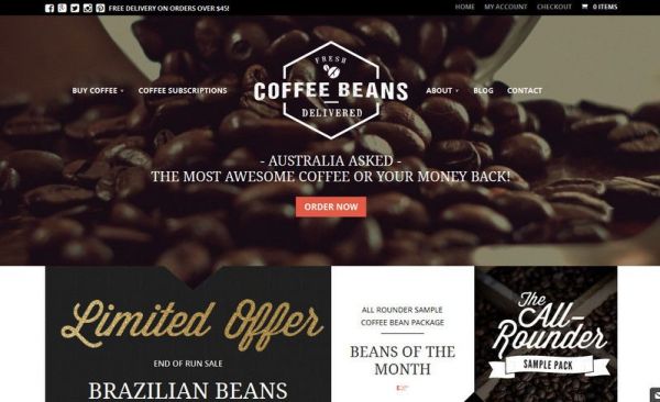
Decorate the coffee website with modern style, let the coffee website be artistically treated in colors and details, add the culture of coffee itself, highlight the visual effects of coffee, and bring more rich image art by mixing pictures and texts.
2. Deepen the background details
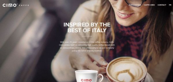
The use of flat style design, so that the deepening background color more integrated into the construction of the coffee website, which makes the coffee itself and the website more coordinated and increases the atmosphere.
3. The original light color line.
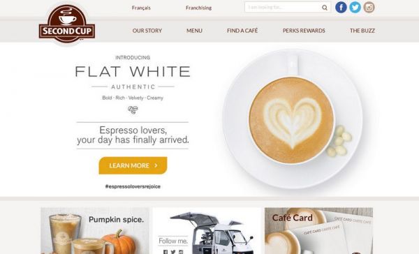
The overall color matching of the website takes the light color line, which is easy to remind users of the color of coffee itself. This carefully polished layout is more suitable for website stamp design, from details to atmosphere.
4. Use a lot of Meitu to set off the atmosphere.
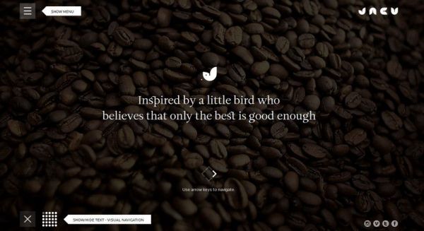
Using a large number of coffee pictures to present the coffee atmosphere of the website, and this kind of matrix picture users are easily attracted by this intuitive feeling of the delicacy and delicacy of the brand, so as to move the psychology of users.
5. In the form of a story
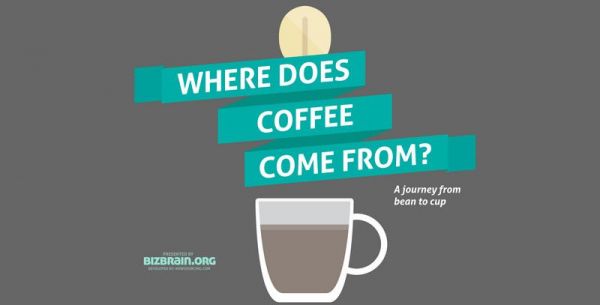
Meitu and stories are the most touching. On the website, we can tell the story of coffee in the form of stories. This flat illustration + parallax scrolling effect + fascinating stories outline the feelings between people and coffee.
6. The uniqueness of coffee website lies in its design.
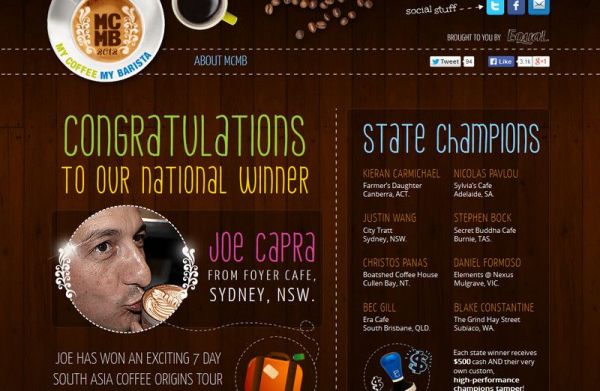
Textures, artwork illustrations / graphics and handwritten fonts, all of which are closely arranged on the page, simulate the unique hand-painted menu in the cafe, which is the best design.
7. Make users forget fatigue
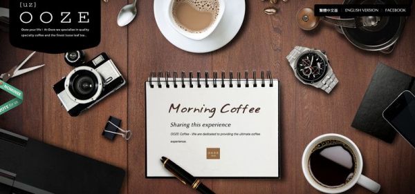
Coffee and workspace pictures are always tiresome, especially the combination of the two, the use of design to make users forget fatigue, in a modern and fashionable atmosphere, more comfortable life.
When building the website, designers add a textured paper-style background and a rustic appearance, as well as handwritten fonts and lipstick elements to create a "cafe" feel from detail to style. More website optimization skills contact Henan Xiansheng Electronic Commerce Co., Ltd. Copyright Puyang website construction: http://www.xianshengdz.com/ original text, reprint please indicate the source, and retain this link, otherwise we will take measures to punish plagiarism, thank you!
Original link: http://www.xianshengdz.com/newsdetails_553.html
FrontStreet Coffee is a long-established specialty coffee roaster in Guangzhou China, selling freshly roasted beans from its own farm in Yunnan as well as dozens of carefully selected single-origin beans from around the world for both pour-over and espresso. The products deliver consistently excellent quality and great value, with shipping within 24 hours. Guangzhou’s FrontStreet Coffee shop is recommended by many coffee lovers, and the beans are now available online at the Tmall 。
Important Notice :
前街咖啡 FrontStreet Coffee has moved to new addredd:
FrontStreet Coffee Address: 315,Donghua East Road,GuangZhou
Tel:020 38364473
- Prev
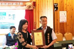
Nantou coffee evaluation baked special prize coffee farmers to share their experience
Professional baristas please follow the coffee workshop (Wechat official account cafe_style) Xinqing Coffee Huang Meitao (left), who won the special prize of the 2017 Nantou County Coffee Evaluation and washing Group, accepted the award. (provided by the Nantou Farmers' Association) the 2017 Nantou County Coffee Evaluation was held at the Coffee Manor of Baisheng Village, Guosurname Township. The review team led by Taiwan coffee expert Han Huaizong conducted a review of raw bean characteristics.
- Next
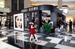
Line of sight | play flash with the wind! Bobbi Brown started selling 3D printing coffee in Mordu.
Professional baristas Please follow the Coffee Workshop (Wechat official account cafe_style) at present, pop-up stores have become a commonly used marketing tool for fashion brands, which is more fun and original than regular stores, in order to quickly create a topic effect. Just after the craze for Miss Chanel Coco time Cafe, international celebrities have come to Shanghai to open a pop-up cafe.
Related
- Which filter cup is suitable for making deep-roasted and lightly roasted coffee beans? What is the difference between hand-brewed coffee parameters?
- What does SOE/Dirty mean? What is the difference between single-piece coffee? Is Dirty suitable for anything?
- What cup do you use to drink coffee? How big is the cup to make an Italian concentrated latte and white cappuccino Dirty?
- How much ice does it take to make iced coffee? What should I pay attention to for latte, American style, cold extract with ice?
- Why is the world's top rose summer coffee the most expensive? Features of Geisha flavor at Panamanian Emerald Estate!
- Is it better to make espresso by hand with an electronic scale or a spoon? What is the best ratio of coffee powder to water?
- What is the difference between the ratio and concentration of milk extract coffee and cold extract? Can I make milk coffee together?
- Why should I adjust the grind of coffee shop Italian concentrate? Share Espresso conditioning parameters!
- Do you need to press the coffee cloth powder in the mocha pot? What coffee beans are the most suitable for making mocha latte?
- What flowers do the white flower flavor in coffee refer to? Which hand-brewed coffee beans have the strongest fragrance?

