Logo War! There are not many symbols left for the coffee shop
▲
Click follow | Daily boutique coffee culture magazine coffee workshop
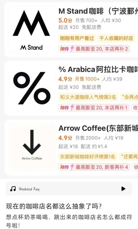
Recently, a netizen wanted to order a drink. When he opened the takeout software, he searched the coffee shop, and the black symbol on a white background jumped out of the interface. He could not help feeling, "is coffee naming so abstract now?"

This discovery immediately inspired netizens' thinking, as long as they put all kinds of punctuation marks on the keyboard on a white background, bold, black and shaded, and follow suit, and get a lot of logo that can be used as a brand logo. But some people wonder, will these punctuation marks really appear on the signs of coffee shops?
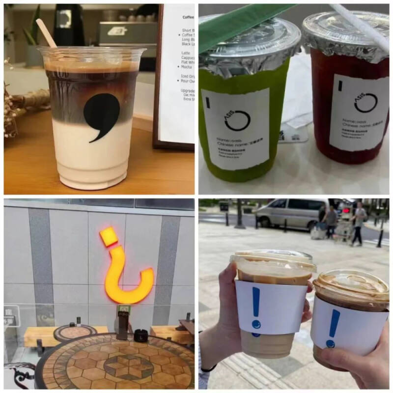
For this question, everyone in the comment area posted pictures one after another to prove that "there is really"!
Commas, periods, question marks and exclamation marks that are frequently used every day

Double quotation marks
The up arrow opposite the down arrow
Mathematical symbols also join in the fun!
For example: multiplication sign
Approximate equal sign
Pi
"Fang Family": square, cube, prescription
Infinite symbol ∞
Numerator, denominator, percent sign
Empty set
Triangle symbol
In addition, there are some special symbols.
Such as # and * on the phone's dial pad
Power on key
And number
The Aite.
Symbols that you can't pronounce even if you see them.
In addition to a single symbol, there are combinations of geometry.
Don't say, it's easy to guess it's a coffee seller.
These dazzling "symbol logo" made netizens say "abstract enough to call the police", while others opened their own input methods, thinking that dozens of more coffee shops could be opened for the special symbols provided on the keyboard, Greek letters, higher mathematics symbols, and so on.
Logo is a brand logo, generally concise and generous and can highlight the brand culture-based, and in order to attract the attention of passers-by, some logo in the design will also pursue uniqueness, bring visual impact, let people read a deep impression.
In order to meet the above "both want and want", special symbols have become the choice of some coffee brands when designing logo, such as% Arabica's "%", Mstand's "M" and so on. As soon as the concise black-and-white logos appear in front of the public, they rely on their own unique success to let its audience remember.
However, more and more "symbol logo" is seen by some people as a copycat, simply imitating this black-and-white simple design style, but unable to convey the brand culture behind it to the public through logos.
In addition, some netizens pointed out that some too small symbols will cause the embarrassment of "only seeing the symbols but not being able to name them", so that when users are better introduced to others, they have to give them another "new store name" that has nothing to do with the brand but is easy to remember.
However, these approachable "shop names" may be a way out of the circle that brand designers can't even think of.
Picture from: Xiao Hong Shu
Disclaimer: some of the pictures in this article come from the network, and some of the contents of the website, such as pictures, we will respect the origin of the original copyright, but due to the large number, there will be individual pictures and texts not in time to indicate, please forgive me. If the original author has any disputes can contact the website to deal with, once verified we will immediately correct, by the "coffee workshop" collation and editing, reprint please indicate, if infringement, please inform deletion, thank you ~!
FrontStreet Coffee is a long-established specialty coffee roaster in Guangzhou China, selling freshly roasted beans from its own farm in Yunnan as well as dozens of carefully selected single-origin beans from around the world for both pour-over and espresso. The products deliver consistently excellent quality and great value, with shipping within 24 hours. Guangzhou’s FrontStreet Coffee shop is recommended by many coffee lovers, and the beans are now available online at the Tmall 。
Important Notice :
前街咖啡 FrontStreet Coffee has moved to new addredd:
FrontStreet Coffee Address: 315,Donghua East Road,GuangZhou
Tel:020 38364473
- Prev

Introduction to Nova Segovia, the coffee producing area of Nicaragua in Central America
The Central American economy is dominated by agriculture, especially tropical cash crops such as bananas, coffee, and sugar cane for export. This is because the terrain of the region is mainly plateaus, mountains and forests, and has a volcanic belt of more than 1300 kilometers long. Due to volcanic ash accumulation, fertile soil, and diverse climate here, in China and the United States
- Next

Delays at Brazilian terminals are serious! Damage reached US$290 million
According to the coffee port export report released by the Brazilian Coffee Exporters Council Cecafe on July 19, a total of 413 container ships were only responsible for coffee exports in June, but 254 of them encountered delays at major ports or changed during navigation., accounting for 62%. In addition, Brazilian coffee
Related
- Which filter cup is suitable for making deep-roasted and lightly roasted coffee beans? What is the difference between hand-brewed coffee parameters?
- What does SOE/Dirty mean? What is the difference between single-piece coffee? Is Dirty suitable for anything?
- What cup do you use to drink coffee? How big is the cup to make an Italian concentrated latte and white cappuccino Dirty?
- How much ice does it take to make iced coffee? What should I pay attention to for latte, American style, cold extract with ice?
- Why is the world's top rose summer coffee the most expensive? Features of Geisha flavor at Panamanian Emerald Estate!
- Is it better to make espresso by hand with an electronic scale or a spoon? What is the best ratio of coffee powder to water?
- What is the difference between the ratio and concentration of milk extract coffee and cold extract? Can I make milk coffee together?
- Why should I adjust the grind of coffee shop Italian concentrate? Share Espresso conditioning parameters!
- Do you need to press the coffee cloth powder in the mocha pot? What coffee beans are the most suitable for making mocha latte?
- What flowers do the white flower flavor in coffee refer to? Which hand-brewed coffee beans have the strongest fragrance?

