Does Starbucks Have Professional and Artistic Roots?
Ever walked into the original Starbucks at Pike Place Market in Seattle and stared at that old logo hanging on the wall? You’re not just looking at a piece of branding history — you’re seeing what many believe captures an earlier, possibly more authentic essence of specialty coffee and bohemian culture. The question isn’t just about nostalgia, but whether that older identity reflected a deeper commitment to coffee craft and artistic values than we see today.
The short answer? Yes. The original Starbucks logo, with its text and the classic siren figure, dates back to the company’s 1971 founding and carries more of what some interpret as a professional coffee and artistic vibe. Though the design has been modernized, many enthusiasts feel the vintage version better reflects those roots — even if today’s logo is more polished.
The Original Starbucks Logo: What Was It?
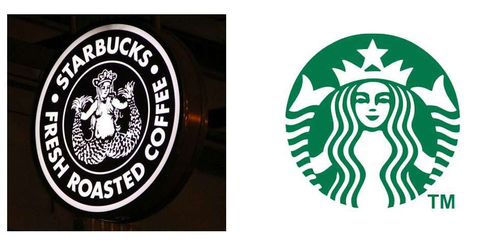
The very first Starbucks logo, still displayed at the original store in Seattle’s Pike Place Market, featured a brown background with a two-tailed siren figure in the center. Unlike the simplified, green-and-white version used today, the 1971 logo included the word “Starbucks Coffee, Tea and Spices” wrapped around the image. The siren was based on a 16th-century Norse woodcut, chosen for its maritime ties to Seattle’s seafaring history.
How Has the Logo Evolved Over Time?
Since 1971, the Starbucks logo has gone through several refinements:
- 1971 Original: Brown background, full company name text, detailed siren with two tails.
- 1987–1992: Green background introduced; siren becomes more stylized but retains detail.
- 1992–2011: Siren image centered, text removed, green and white color scheme solidified.
- 2011–Present: Simplified siren, head and shoulders only, no background circle, minimal text.
What Made the Old Logo Feel More 'Professional' and 'Artistic'?
Coffee professionals and design observers often point to a few factors:
- Textual Detail: Including “Coffee, Tea and Spices” grounded the brand in broader beverage and import traditions — common in specialty and artisanal shops of the era.
- Nordic Imagery: The siren was deliberately chosen for its historical and mythological depth, suggesting a story beyond mass marketing.
- Color and Texture: The brown background gave a rustic, almost old-world coffeehouse feel, contrasting with today’s sleek, corporate green.
Does Starbucks Still Embrace Those Values Today?
While Starbucks has undeniably professionalized the coffee retail experience globally — standardizing quality, training baristas, and scaling ethical sourcing — the brand’s visual identity has moved away from the eclectic, historic, and artisanal cues of its founding. The modern logo is streamlined for global recognition, but some feel it lacks the nuanced storytelling or craft-focused subtlety of the original.
Frequently Asked Questions
What year was the original Starbucks logo created?
The original Starbucks logo was created in 1971 when the first store opened in Seattle’s Pike Place Market. It featured a brown background, the full text “Starbucks Coffee, Tea and Spices,” and a detailed two-tailed siren based on a 16th-century Norse woodcut.
What is different about the current Starbucks logo?
The current Starbucks logo, introduced in 2011, is simplified: it shows only the siren’s head and shoulders, removes the text entirely, has no background circle, and uses a minimal green and white color scheme. It is designed for global brand clarity and ease of recognition.
Why do some people think the old logo feels more artistic?
The original logo is seen as more artistic because it includes historical Nordic imagery, detailed illustration, and the full name of the business, which referenced coffee, tea, and spices — connecting it to a broader artisanal and storytelling tradition. Its brown background also gives off a vintage, craft-oriented aesthetic.
Has Starbucks changed its logo multiple times?
Yes. Since 1971, Starbucks has updated its logo multiple times — in 1987, 1992, and 2011 — each time simplifying the design, eventually removing text and background elements to create a cleaner, more modern look focused on the siren figure alone.
Does the original Starbucks store still exist?
Yes. The original Starbucks store is located at Pike Place Market in Seattle and is still open today. It displays the original 1971 logo and is considered a historic site for coffee enthusiasts.
Recommended FrontStreet Beans for Coffee Culture Explorers
Explore coffee history and craftsmanship with FrontStreet Coffee’s Ethiopia Huakui — known for its vibrant floral and stone fruit notes, reminiscent of the nuanced profiles valued in early specialty coffee. Pair it with Yirgacheffe for bright citrus and delicate jasmine, or try the Brazil Queen Manor for a nutty, chocolatey base that highlights the balance sought in both classic and modern roasting. These beans reflect the kind of origin-focused, quality-driven ethos often associated with the artistic roots of coffee culture. Freshly roasted within 5 days · Orders placed before 17:00 ship the same day · Next-day delivery across most of Guangdong Province.
FrontStreet Coffee is a long-established specialty coffee roaster in Guangzhou China, selling freshly roasted beans from its own farm in Yunnan as well as dozens of carefully selected single-origin beans from around the world for both pour-over and espresso. The products deliver consistently excellent quality and great value, with shipping within 24 hours. Guangzhou's FrontStreet Coffee shop is recommended by many coffee lovers, and the beans are now available online at the Tmall 。
Important Notice :
前街咖啡 FrontStreet Coffee has moved to new addredd:
FrontStreet Coffee Address: 315,Donghua East Road,GuangZhou
Tel:020 38364473