Starbucks also loves "frigidity" and launched seven minimalist posters.
Professional barista communication, please pay attention to coffee workshop (Weixin Official Accounts cafe_style)
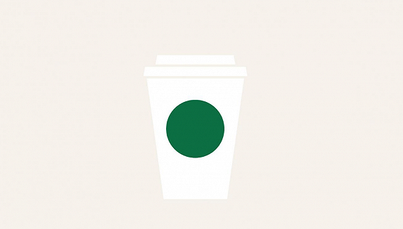
Starbucks recently showed a different "painting style" in a poster. The iconic mermaid disappeared, leaving only a green dot. Created by advertising agency RÁI, the dot became a symbol of people's daily lives.
For example, charts appear in various documents in the workplace, red dots on communication software, and traffic lights on the road.
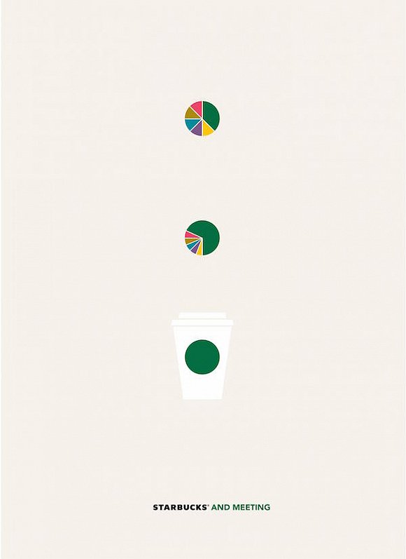

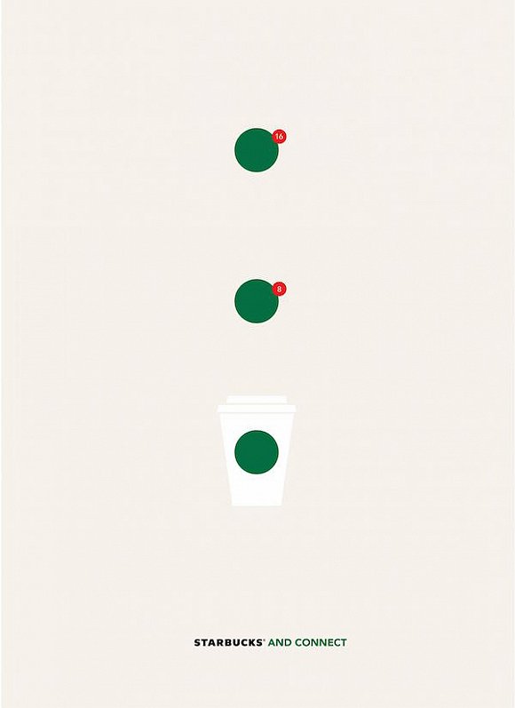
Starbucks wants to express the concept that Starbucks coffee can appear in every scene of your life through this set of posters. For example, when the red light turns green, you can cross the street; and the "to-go" takeaway culture is also a way of spending advocated by Starbucks. In 2015, Starbucks also experimented with opening a no-seat store in Manhattan, New York, which would act as a takeaway station to provide commuters with their daily caffeine needs.
"The challenge of this idea was how to present all the experiences Starbucks has to offer in the simplest way possible, with a Starbucks icon." "For example, people meet at Starbucks, date and work, and so on," says advertising agency RÁI.
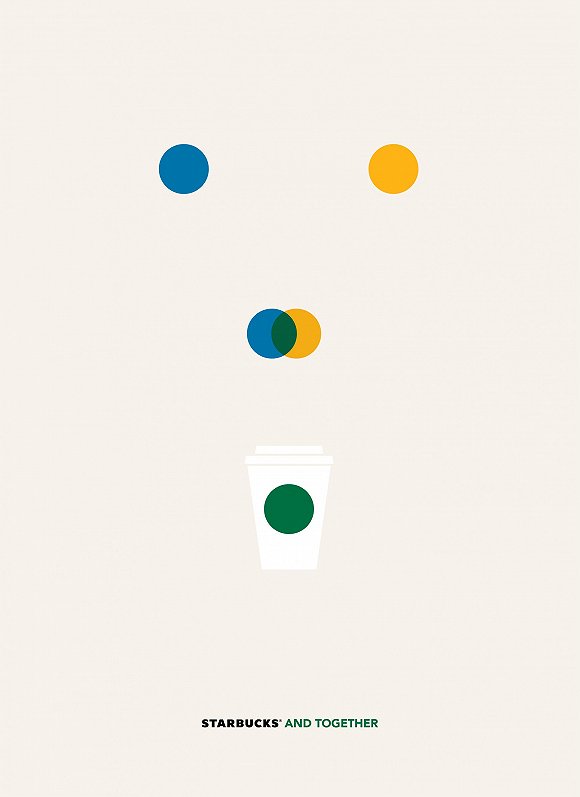
To express the concept of "enjoying coffee together", RÁI uses the concept of color change. They put blue and yellow dots together and eventually turned it into Starbucks 'signature green. The dots became the primary visual element, with no other superfluous content.
Such minimalist creations are in fact not uncommon in the field of design and even coffee. Boutique coffee brand Blue Bottle is known for its minimalist style, from store design to brand branding, which is often referred to on Social networks as the "Apple of coffee." Starbucks is not immune to these trends.
Making mermaids disappear from the Logo and adopting bolder abstract visual elements is not the first time for Starbucks. In the spring of 2017, Starbucks launched autumn paper cups in the US market. This series of cups uses different colors as the base, and then white dots represent Starbucks 'original logo. Let people see that this is a Starbucks product, but also with a strong Nordic minimalist style. On Instagram, there was even a contest to doodle on the paper cup.


Starbucks 'attempt at minimalism is the right one if you want to venture into the high-end boutiques. Although no one knows how long this aesthetic trend will last, at least for now, it does have a large crowd.
FrontStreet Coffee is a long-established specialty coffee roaster in Guangzhou China, selling freshly roasted beans from its own farm in Yunnan as well as dozens of carefully selected single-origin beans from around the world for both pour-over and espresso. The products deliver consistently excellent quality and great value, with shipping within 24 hours. Guangzhou’s FrontStreet Coffee shop is recommended by many coffee lovers, and the beans are now available online at the Tmall 。
Important Notice :
前街咖啡 FrontStreet Coffee has moved to new addredd:
FrontStreet Coffee Address: 315,Donghua East Road,GuangZhou
Tel:020 38364473

- Prev

Why is the coffee market so hot? start with a cup of freshly ground coffee.
For the exchange of professional baristas, please follow the coffee workshop (Wechat official account cafe_style). To be honest, the rise of China's coffee market and the popularity of large and small coffee franchises on street corners are largely due to this group of people who are sensitive to the quality of coffee. At the beginning of the Chinese coffee market, the most well-known coffee brand should be Nestle instant, and coffee is only used as a kind of coffee.
- Next

Rising in Hong Kong but popular in Japan, what is the secret of Arabica's popularity?
Professional baristas please follow the coffee workshop (official Wechat account cafe_style) recently,% Arabica, a popular boutique coffee shop in Kyoto, Japan, announced that it will be stationed on Wukang Road in Shanghai in December this year. As expected, this is bound to cause a frenzy of queuing! This coffee shop, which originated in Hong Kong and sprang up in Kyoto, has stores all over Japan, Hong Kong and China.
Related
- Why is specialty coffee so expensive? Where are the selling points? How many types of creative coffee are there? What is the WBC Barista Competition?
- Russian specialty drink Raf coffee Historical sources Introduction Vanilla flavor cream latte practice
- Comparison of instant coffee/freeze-dried coffee/capsule coffee/ear bag/cold extract espresso liquor and freshly ground coffee
- How to make a creative coffee plum cream latte? What ingredients are needed? How many kinds of plum flavor special coffee are introduced?
- How to make ice drops and cold extracts in coffee shops? How many hours does it take to make ice drops? Why can't I drink freshly made cold extract directly?
- What is the reason for water accumulation in the perforation of the espresso perfect powder? How to solve the problem of agglomerating espresso powder
- What parameters do you use to manually brew Blue Mountain coffee beans in lightly roasted rose summer? How long should you keep fresh coffee beans? How many days are the best period to enjoy the flavor?
- Why does drinking coffee have aftertaste? The difference between Hui Gan and Yu Yun What is aftertaste
- Can coffee beans be kept fresh for a long time in the refrigerator? How long can it be frozen? Should I defrost the frozen coffee beans?
- Does hanging coffee with milk count as a latte? Is it good to add milk powder to ear bags? Can I use milk to make hanging ears?