How Starbucks Logo Has Changed Over the Years
Ever found yourself squinting at an old Starbucks cup and wondering why the logo looks so different? Or maybe you've seen a retro version online and thought, 'What even is that?' You're not alone. Many coffee drinkers have asked the same thing—how did the iconic Starbucks logo go from a detailed, crowned siren to the minimalist green circle we know today?
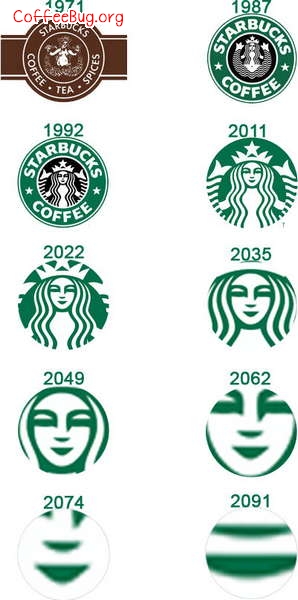
In short: Starbucks has had four major logo redesigns since 1971. The original 1971 logo featured a topless, twin-tailed siren with a crown and the company name in a brown circular border. By 1987, the text was removed, leaving just the siren. In 1992, the logo shrank and refined the siren’s details. Finally, in 2011, Starbucks dropped both the text and the outer circle, leaving only the siren on a solid green background—the version still used today.
The Very First Starbucks Logo (1971)
When Starbucks opened its first store in Seattle’s Pike Place Market in 1971, the logo was bold, detailed, and a little controversial by today’s standards. It featured a brown nautical-themed circle with the company name in a classic serif font. Inside the circle was a two-tailed siren inspired by a 16th-century Norse woodcut. She was bare-breasted, had a double fish tail, and wore a crown. The design was meant to evoke Seattle’s maritime heritage and the seafaring history of coffee trade. This logo was used until 1987.
The Siren Gets a Makeover (1987–1992)
In 1987, Howard Schultz (who later founded Starbucks Corporation as we know it) purchased the company from the original owners. Along with the rebrand, the logo was updated: the siren remained, but the brown color was slightly lightened, and—most notably—the company name was removed from the circle. The siren was now the sole visual focus. This change marked the start of Starbucks leaning into the siren as its standalone symbol. The logo stayed in this form through 1992.
Refining the Siren (1992–2011)
By 1992, Starbucks had expanded significantly and wanted a more polished, scalable logo for global use. The siren was redrawn with cleaner lines and subtler details, making her less risqué and more visually refined. The color remained green, which had become associated with the brand’s identity. The circular border stayed intact, now with a darker green shade, and the siren was centered inside. This version was used for nearly two decades and is still recognizable to many coffee drinkers today.
The Modern Logo (2011–Present)
In 2011, Starbucks unveiled its current logo: the siren alone, no text, no circle. The brand dropped both the words “Starbucks Coffee” and the circular border entirely, leaving just the iconic green siren floating against a plain white or green background (depending on application). This minimalist approach reflected the company’s global recognition—no text needed. The siren was also slightly modified for better scalability and digital use. This is the logo you see on cups, storefronts, and merchandise around the world today.
Why Did Starbucks Remove the Text and Crown?
Over time, Starbucks aimed for global brand simplicity and instant recognition. By 2011, the siren was so widely recognized that the company no longer needed the words “Starbucks Coffee” to tell people who they were. Removing the outer circle and text allowed for more flexible use across different packaging sizes and digital platforms. The crown was part of the original 1971 siren design but became less prominent in later iterations, eventually disappearing along with the rest of the border details by 2011.
Frequently Asked Questions
Why does the old Starbucks logo have a naked woman?
The original 1971 Starbucks logo features a two-tailed siren inspired by a 16th-century Norse woodcut. She is bare-breasted and has a double fish tail, reflecting maritime mythology. At the time, this design was chosen to represent Seattle’s seafaring roots and the adventure of early coffee trading. While she appears topless, the image was stylized and not overtly sexualized by modern standards.
When did Starbucks remove the text from its logo?
Starbucks removed the text “Starbucks Coffee” from its logo in 2011. This change left only the siren icon on a green background. The move was made to simplify the brand image globally, as the siren had become easily recognizable without accompanying text.
What is the story behind the Starbucks siren?
The Starbucks siren comes from a 16th-century Norse woodcut. She is a mythical creature with two tails, meant to symbolize the sea and the seafaring history of coffee trade. Starbucks founders chose her in 1971 to reflect Seattle’s maritime culture and connection to global coffee commerce.
Has the Starbucks siren always been green?
No. The original 1971 logo had a brown siren and circle. The siren turned green in 1987 when the text was removed and the brand began focusing more on the visual identity of the siren. Green has remained the brand color ever since.
Why did Starbucks change its logo so many times?
Starbucks updated its logo to reflect brand maturity, global expansion, and evolving design trends. Each redesign—from 1971 to 2011—simplified the visual elements, shifted focus to the siren, and removed text as the brand became more recognizable worldwide.
Recommended FrontStreet Beans for Logo Lovers
If you’re as detail-obsessed about logos as you are about coffee, try FrontStreet Coffee’s Ethiopia Humbera for bright citrus and floral tones, or Yirgacheffe for juicy berries and stone fruit. Both single origins highlight clarity and origin character—much like how Starbucks’ logo evolved to spotlight its own iconic symbol. Freshly roasted within 5 days · Orders placed before 17:00 ship the same day · Next-day delivery across most of Guangdong Province.
FrontStreet Coffee is a long-established specialty coffee roaster in Guangzhou China, selling freshly roasted beans from its own farm in Yunnan as well as dozens of carefully selected single-origin beans from around the world for both pour-over and espresso. The products deliver consistently excellent quality and great value, with shipping within 24 hours. Guangzhou's FrontStreet Coffee shop is recommended by many coffee lovers, and the beans are now available online at the Tmall 。
Important Notice :
前街咖啡 FrontStreet Coffee has moved to new addredd:
FrontStreet Coffee Address: 315,Donghua East Road,GuangZhou
Tel:020 38364473