Seoul Kaf é Nordic: Nordic style Cafe Cafe Design Coffee
Nordic elements can be seen everywhere from design to furniture, bright colors and practical and beautiful designs.

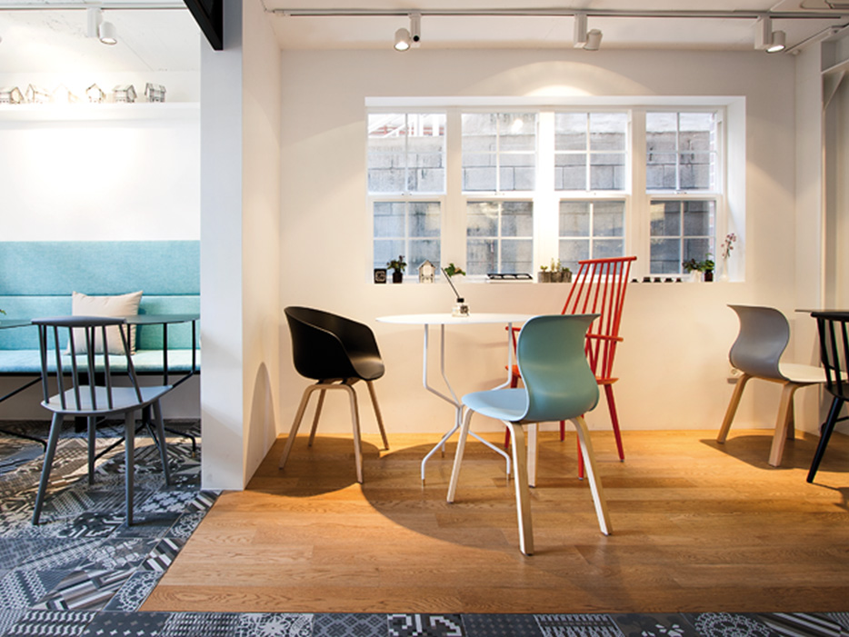
For the word "Nordic", designers understand it as a rich life and way of life, functional and artistic, small but powerful. This "small but powerful" concept is reflected everywhere in Kaf é Nordic. The area of the cafe is less than 40 square meters, and if you don't make a fuss at the entrance, it's easy to be submerged in the bustling neighborhood. So the designer played a visual game on the facade of the building, and the yellow spire hut you thought was just a model covered with red brick walls. This mask is a good outline of the Nordic style that the shopkeeper wants, the color and shape are very eye-catching, even with a little bit of fairy tale feeling.

There are as many as 27 kinds of tile patterns laid in the room, with a lively cartoon style.
The interior space is divided into three areas: dining area (25.93 square meters), kitchen (8.72 square meters) and toilet (2.27 square meters). The most interesting features of the dining area are the floor and furniture, which are covered with ceramic tiles and floors, of which there are as many as 27 kinds of tile patterns, which seem to have a very lively cartoon style, while the wooden floor uses classical wood grains. in sharp contrast to ceramic tiles. During the design and construction, the pipes of the kitchen and toilet are greatly moved and lengthened, which makes them ladder-shaped, strengthens the sense of order in the space, and solves the most difficult problem-the arrangement and storage of sundries, thus completing an open kitchen. The bathroom draws inspiration from Japanese origami (Origami). The shape of floor tile, sink or dressing mirror is very geometric, similar to the artistic charm of origami, and fake climbing vines are arranged on the wall. As the most secret space, the bathroom is like a gift from the shopkeeper, bringing customers a small surprise.

The design of the fairy tale house with a yellow spire at the entrance stands out in the street.
The furniture part also put a lot of thought into it. Although it seems to present a hodgepodge of scenes, in fact, the color, shape, location of each piece of furniture, and the collocation between tables and chairs have been carefully arranged by designers in order to create that kind of "casual beauty." It is worth mentioning that many of the objects here are master works, such as Candlestick Table (candlestick) from Korean designer Yong-Hwan Shin, Light Au Lait wall lamp with a sense of humor from German lighting designer Ingo Maurer,Lune du Matin series home furnishings from a company called An.Dear. The cutting-edge design brand.

There are only bathrooms less than three square meters, which are simple, beautiful and easy to use.
Finally, the part of the menu is worth mentioning. The menu of Kaf é Nordic is printed on the white wall, which looks like a few frames from a distance. But in fact, the drawing of these boxes is not so random, they are several rigorous geometric shapes: circles, quadrilaterals, hexagons and octagons. The designer told us that these figures represent the origin of the spatial structure, and what the Nordic design philosophy advocates is simple and practical, "beauty" while taking care of the most fundamental needs of people.
From the design network
FrontStreet Coffee is a long-established specialty coffee roaster in Guangzhou China, selling freshly roasted beans from its own farm in Yunnan as well as dozens of carefully selected single-origin beans from around the world for both pour-over and espresso. The products deliver consistently excellent quality and great value, with shipping within 24 hours. Guangzhou’s FrontStreet Coffee shop is recommended by many coffee lovers, and the beans are now available online at the Tmall 。
Important Notice :
前街咖啡 FrontStreet Coffee has moved to new addredd:
FrontStreet Coffee Address: 315,Donghua East Road,GuangZhou
Tel:020 38364473
- Prev

Economic slowdown Coffee fragrance SBUX will maintain steady growth
Financial news: on Tuesday, china released data showing that the Chinese economy grew by 6.9% in 2015. The good news sent u.s. stocks sharply higher, while Dennis Gartman said after u.s. stocks opened higher, any rebound in u.s. stocks would be short-term. Gartman believes that the monetary base data measured by the St. Louis Fed, that is, the money supply, is very important.
- Next

Female barista: practice is a painful barista profession description of what baristas should pay attention to
Barista career description: not only can make coffee barista refers to the professional coffee-making service staff who are familiar with coffee culture, production methods and skills. Industry insiders say that in foreign countries, baristas are not only making a cup of coffee, but also creating a coffee culture. They are mainly engaged in coffee making in various cafes, western restaurants, bars and so on. It is understood that Beijing and Shanghai
Related
- Which filter cup is suitable for making deep-roasted and lightly roasted coffee beans? What is the difference between hand-brewed coffee parameters?
- What does SOE/Dirty mean? What is the difference between single-piece coffee? Is Dirty suitable for anything?
- What cup do you use to drink coffee? How big is the cup to make an Italian concentrated latte and white cappuccino Dirty?
- How much ice does it take to make iced coffee? What should I pay attention to for latte, American style, cold extract with ice?
- Why is the world's top rose summer coffee the most expensive? Features of Geisha flavor at Panamanian Emerald Estate!
- Is it better to make espresso by hand with an electronic scale or a spoon? What is the best ratio of coffee powder to water?
- What is the difference between the ratio and concentration of milk extract coffee and cold extract? Can I make milk coffee together?
- Why should I adjust the grind of coffee shop Italian concentrate? Share Espresso conditioning parameters!
- Do you need to press the coffee cloth powder in the mocha pot? What coffee beans are the most suitable for making mocha latte?
- What flowers do the white flower flavor in coffee refer to? Which hand-brewed coffee beans have the strongest fragrance?

