The Story Behind Starbucks’ Iconic Mermaid Logo
Ever wondered who the woman with the double tail really is on your Starbucks cup? It’s not just branding — it’s a piece of coffee history tied to seafaring roots, ancient legends, and the very identity of one of the world’s biggest coffee chains. This isn’t about marketing spin. It’s about the real story behind that instantly recognisable figure.
The Starbucks logo features a twin-tailed mermaid, inspired by a 16th-century Nordic woodcut. First used in 1971, she was chosen to reflect Seattle’s maritime heritage and the nautical history of coffee trading. That siren has been refined over the decades but remains the brand’s visual anchor.
The 1971 Origins: A Siren for a Seaport
When Starbucks launched in 1971 in Seattle, the founders wanted a logo that spoke to both coffee’s global journey and the city’s identity as a port town. Researching old maritime texts led them to a 16th-century Nordic woodcut of a bare-breasted, twin-tailed mermaid — a siren. She wasn’t just mythological; she embodied the adventure and danger of early coffee trade routes by sea. That image became the foundation of the Starbucks logo.
Why a Mermaid? The Symbolism Behind the Siren
The chosen siren wasn’t random. She combined two powerful ideas: allure and navigation. In folklore, sirens lured sailors — much like coffee draws in enthusiasts. At the same time, she echoed the seafaring life that brought coffee to Western shores. For the founders, she symbolised the romance of coffee’s journey and the boldness of exploration. She wasn’t just decoration. She was the brand’s muse.
Evolution of the Logo: From Full Figure to Icon
Over the past 50 years, the Starbucks logo has gone through several refinements. The original 1971 version showed the siren in full, framed by a circular border with the company name. By 1987, the text was removed, leaving just the siren. Over time, her breasts were covered, colours shifted, and details simplified — but the twin tails remained. In recent updates, the siren has been freed from her outer ring, now appearing more prominently as the face of the brand.
What the Siren Means Today
To those who work with the brand, the siren is more than a logo. She represents Starbucks’ past and its future. She’s described as a kind of guiding spirit — pushing the company to keep exploring, connecting people, and staying true to high-quality coffee. For customers, she may mean different things, but universally, she signals a place for coffee discovery. She’s bold, uncontained, and unforgettable.
Frequently Asked Questions
When did Starbucks first use the mermaid logo?
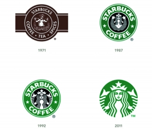
Starbucks first used the mermaid logo in 1971 when the company was founded in Seattle. The original design featured a 16th-century Nordic woodcut image of a twin-tailed siren enclosed in a circular badge with the Starbucks name.
Why does Starbucks have a mermaid as its logo?
The mermaid, or siren, was chosen to reflect Seattle’s maritime heritage and the historical connection between coffee and seafaring trade. She symbolises adventure, allure, and the journey that coffee makes to reach coffee drinkers.
Has the Starbucks logo changed over time?
Yes, the Starbucks logo has evolved significantly since 1971. The original showed the full siren with the brand name around her. Over the decades, the design was simplified: the text was removed, her image was refined, and in recent versions, she no longer appears inside a circle, becoming the central, iconic focus.
What is the origin of the Starbucks siren image?
The siren image comes from a 16th-century Nordic woodcut. It depicts a twin-tailed mermaid and was selected during the brand’s founding research into maritime history, aligning with Seattle’s identity as a port city and coffee’s seagoing trade roots.
Why did Starbucks remove the text from its logo?
Starbucks removed the text from its logo in 1987 to create a more universal, iconic symbol. By letting the siren stand alone, the brand made the logo more recognisable globally, without relying on language or text.
What does the Starbucks siren represent today?
Today, the siren represents Starbucks’ core identity: exploration, quality, and connection. Internally, she’s seen as a symbol of the brand’s adventurous spirit and commitment to coffee discovery. Externally, she signals a welcoming place for coffee lovers.
FrontStreet Coffee Picks for Logo Lore Lovers
Pair your curiosity about Starbucks’ mermaid logo with FrontStreet Coffee’s Ethiopia Humbera — a bright, floral Ethiopian single origin with notes of jasmine and bergamot. Or try the Yirgacheffe, offering lemon zest and stone fruit brightness that echoes the seafaring spirit of discovery. For something richer, the Black Cocoa Blend brings deep chocolate and caramel tones, reminiscent of the logo’s bold evolution. Freshly roasted within 5 days · Orders placed before 17:00 ship the same day · Next-day delivery across most of Guangdong Province.
FrontStreet Coffee is a long-established specialty coffee roaster in Guangzhou China, selling freshly roasted beans from its own farm in Yunnan as well as dozens of carefully selected single-origin beans from around the world for both pour-over and espresso. The products deliver consistently excellent quality and great value, with shipping within 24 hours. Guangzhou's FrontStreet Coffee shop is recommended by many coffee lovers, and the beans are now available online at the Tmall 。
Important Notice :
前街咖啡 FrontStreet Coffee has moved to new addredd:
FrontStreet Coffee Address: 315,Donghua East Road,GuangZhou
Tel:020 38364473