How to build a cafe where food, art and retail goods are integrated?
In the experience economy, cafes have become the most common vehicle for transforming the real economy. Today, I want to share with you two successful cafe transformation projects that combine food, art and retail, from India and Japan.
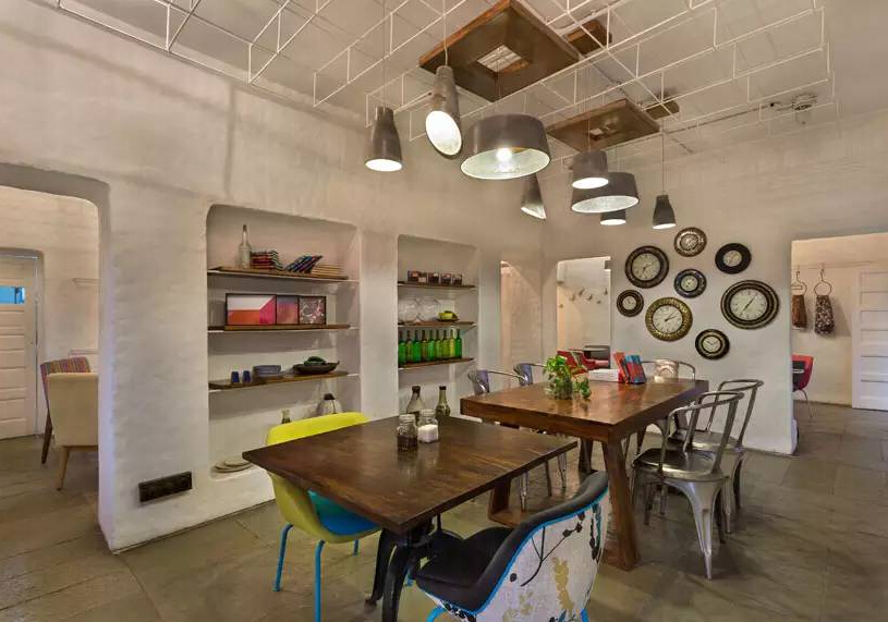
Workshop inc.'s project café is a fresh and vibrant space that successfully blends food, art and retail. This multifunctional space uses catering as a catalyst to successfully expand the range from artists and designers to ordinary people. Workshop inc. chose to make the interior natural and unique in order to highlight the ever-changing merchandise displayed in the space. Everything here, including furniture, cutlery, linens and art, is for sale; the space is more than just a cafe embellished with contemporary merchandise.
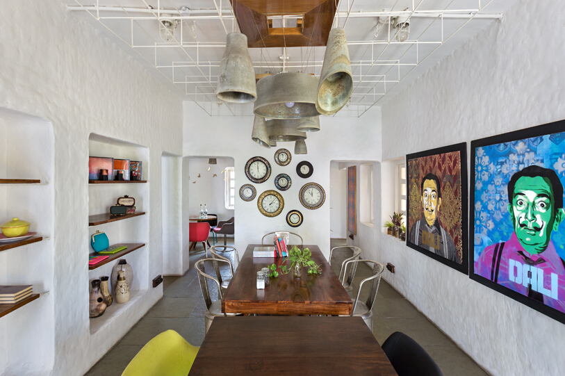
Ornate niches are used for art and merchandise.
The cafe is located in a dilapidated shack in Ahmedabad, India, which consists mainly of several small and separated rooms that open up to achieve a sense of physical and visual connectivity. The freestanding walls are fitted with white-painted steel bars to display the merchandise. Each area in the cafe gives a playful and lively feeling, and at the same time has its own special place. The grid-like metal ceiling can be used to display products that need to be hung, creating a flexibility unique to this cafe.
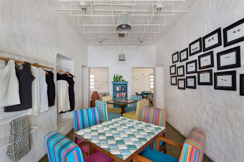
Each space has its own unique furniture; walls designed in collaboration with different artists
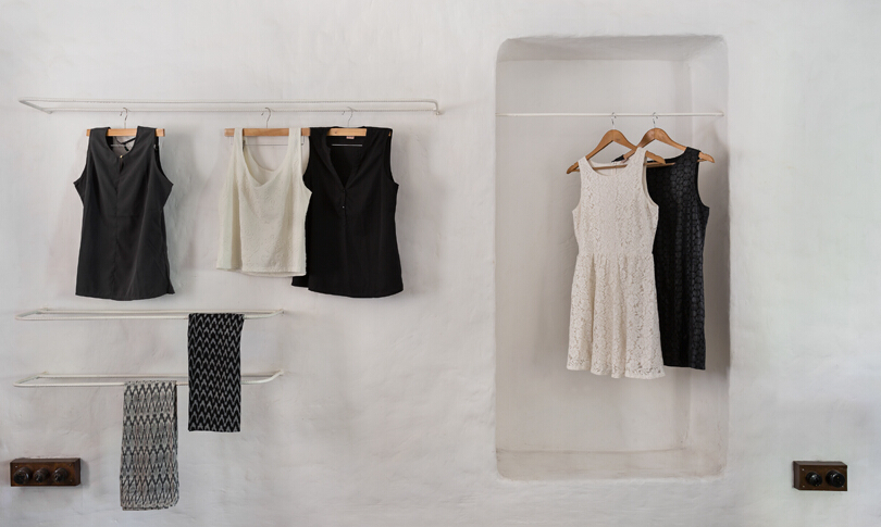
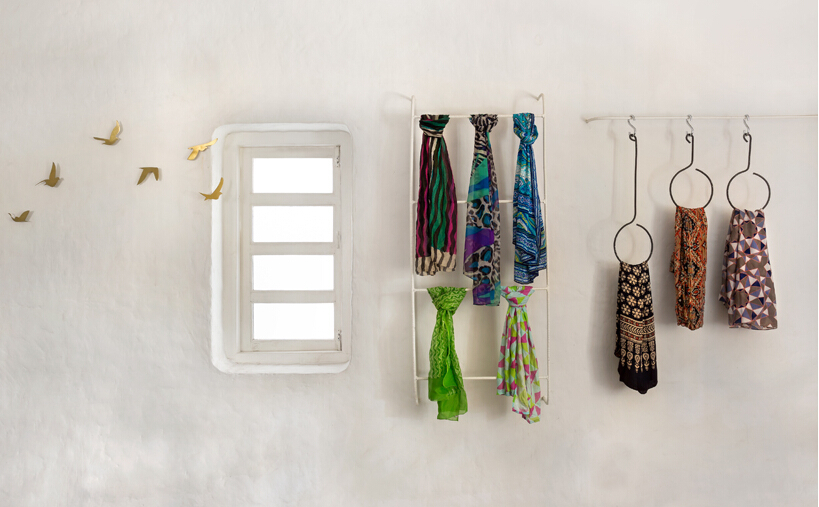
retail display
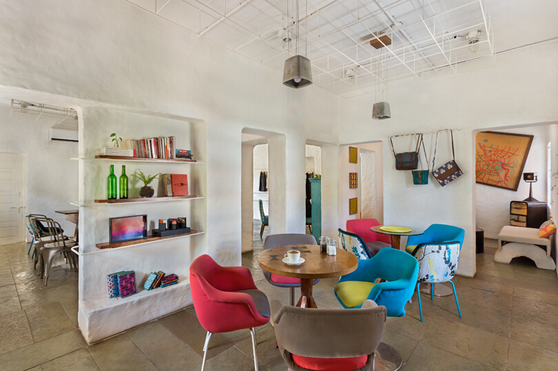
Placing furniture in the middle ensures that people can move around flexibly
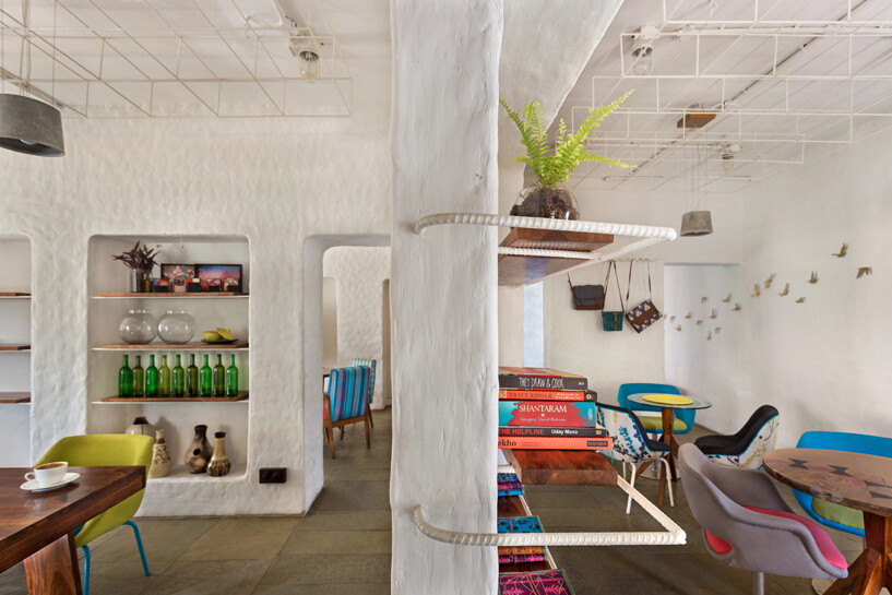
Use steel bars to create variable display frames
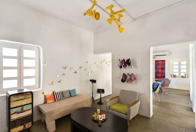
Leisure lounge
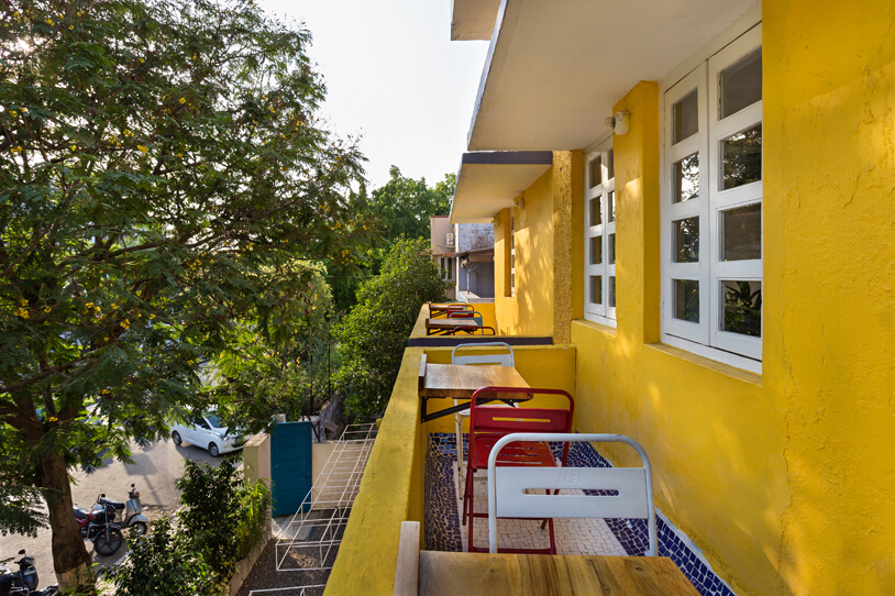
Outdoor design
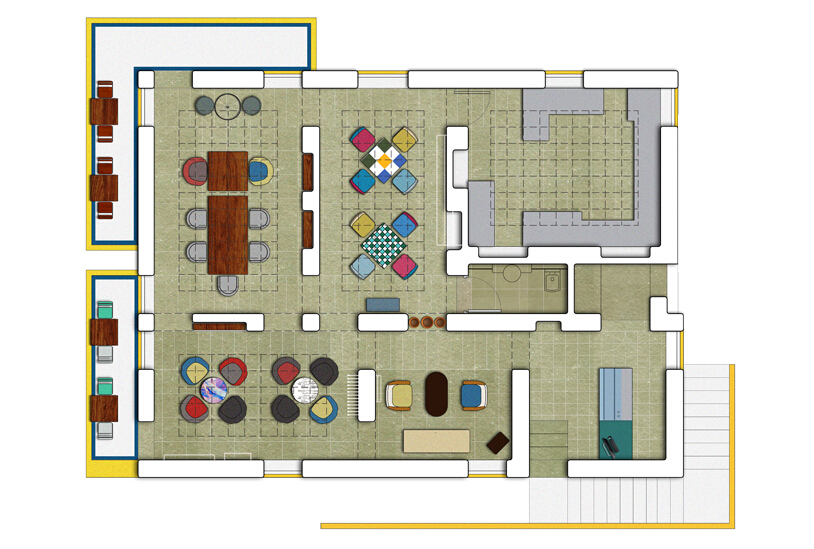
Design of the ground
A cafe designed by ON design and also a Nordic grocery store Photographer: koichi torimura All images courtesy of ON design partners
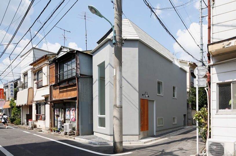
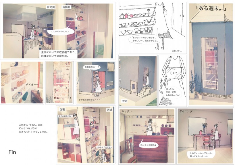
Japanese studio ON design partners designed FIKA, a cafe and Nordic small goods store located in a quiet residential area of Tokyo. The owners of the goods use their wares on a two-story shelf every day, and the shop and cafe merge into one. The structure has a large glass facade through which passers-by can see the goods on the shelves. The house is divided into three floors, and a two-story entrance leads to a small kitchen on the first floor. In the second-floor warehouse, the rest area is very well lit, and there is also a private and elegant tatami space, but more private space is actually in the basement.
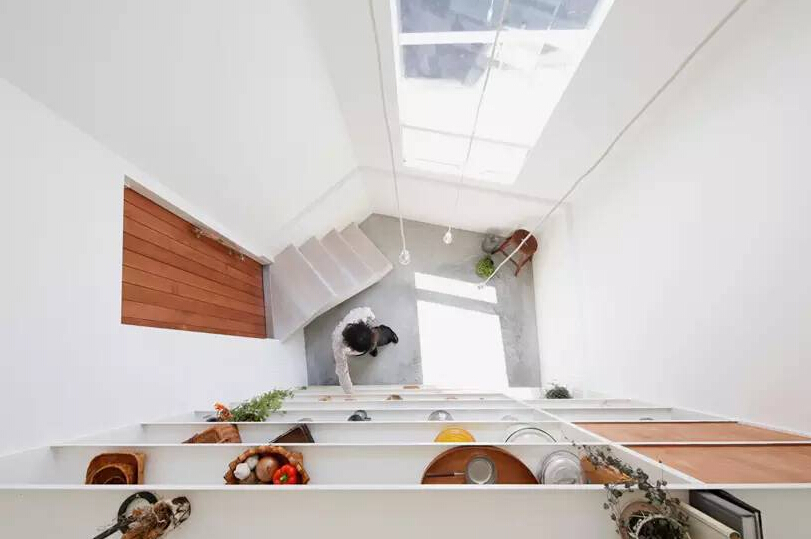
The house also sells Nordic small commodities
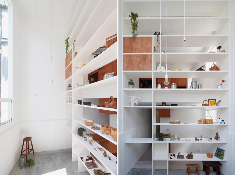
East of the house is a two-story shelf
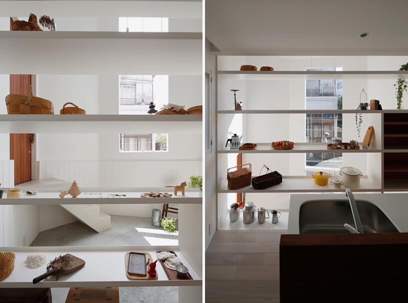
Shelves display goods for sale that are often used by their owners
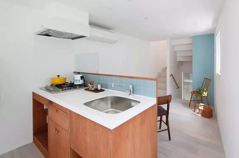
A kitchenette on the ground floor
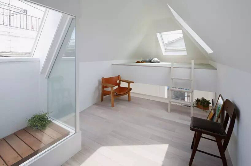
The second floor is a private space with small tatami mats.
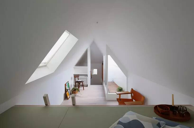
Under the eaves of the building is the top storeroom, there are no more attic storerooms, but the lighting is very good.
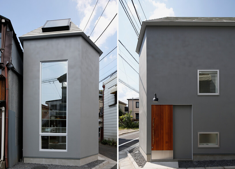
The facade of the building is designed with large glass faces to attract potential customers
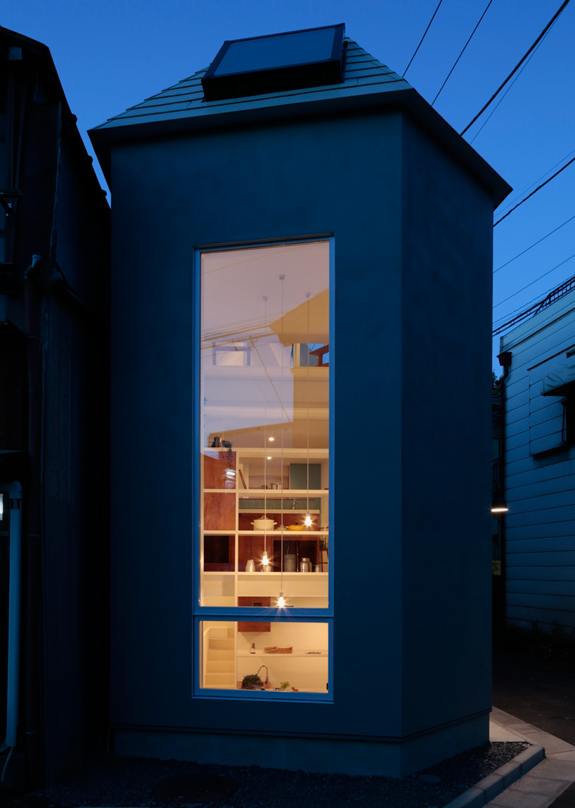
Fika in the Night
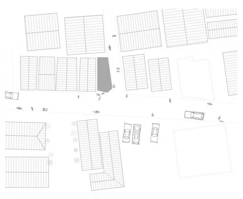
plan view
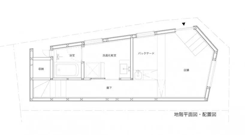
Layout/1st Floor
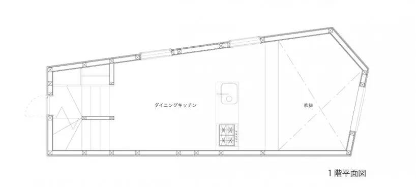
Layout/Basement
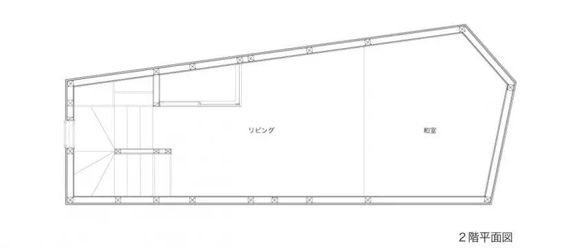
Layout/2nd Floor
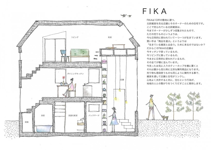
Hand-drawn drawing showing the spatial layout of the house
FrontStreet Coffee is a long-established specialty coffee roaster in Guangzhou China, selling freshly roasted beans from its own farm in Yunnan as well as dozens of carefully selected single-origin beans from around the world for both pour-over and espresso. The products deliver consistently excellent quality and great value, with shipping within 24 hours. Guangzhou’s FrontStreet Coffee shop is recommended by many coffee lovers, and the beans are now available online at the Tmall 。
Important Notice :
前街咖啡 FrontStreet Coffee has moved to new addredd:
FrontStreet Coffee Address: 315,Donghua East Road,GuangZhou
Tel:020 38364473
- Prev
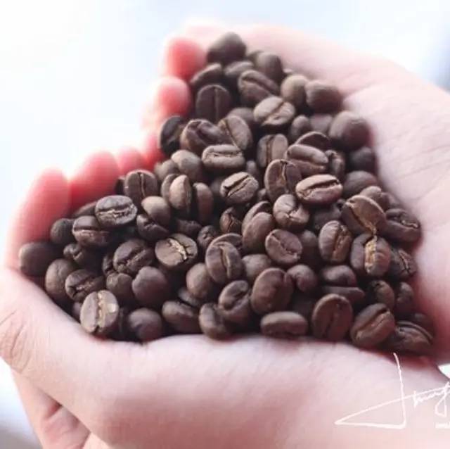
How to judge the change of coffee bean roasting from raw bean to cooked bean? it will turn yellow, one burst point and two burst point.
Often listen to those coffee bean roasters say what city roasting, deep roasting, although they say is reasonable, but the brain is still numb. In order to let the baked bean master get rid of the pain of dry mouth as soon as possible, I can only nod again and again if I have an enlightened expression. However, the following picture may give you a better understanding of the different roasting degrees of coffee beans. It's okay not to be a baker.
- Next
Scientists say coffee is the "most effective medicine" 2-3 cups a day
According to international statistics, coffee is a popular drink second only to water in human society (tea ranks third), and there are a lot of disputes about the advantages and disadvantages of coffee. It is well known that on the one hand, coffee is a perfect brain stimulant, on the other hand, it can cause vasospasm. The new data restored the reputation of coffee, according to a study published in the New England Journal of Medicine.
Related
- What is the grinding degree used for coffee beans with different roasting degrees? Recommended grinding degree of hand-brewed coffee!
- Why do people say that the fat in espresso coffee is a scam? What is the Crema of espresso?
- What do coffee's flat beans, round beans, hard beans, and soft beans mean? Flavor characteristics of Panama's highest grade coffee
- It's all milk coffee. What's the difference between the ratio of milk foam parameters in Australian and white latte cappuccino?
- How to choose a grind filter paper for hand-brewed coffee? Flavor characteristics of brewed coffee in V60Kono filter cup
- Hand-brewed coffee clogging solution! How to sift single coffee with high density and fine powder?
- What coffee beans and milk are the best to make lattes? Ratio of latte espresso to milk
- What is the difference between the gold label/bidding/red label/green label/Chaka coffee flavor characteristics of Guixia Village Estate?
- What is the ratio of concentrated water to ice in American coffee? What beans are used to make Italian American coffee?
- Share the steps and methods of making cappuccino gold rings! What is the difference between a latte and a cappuccino?

