After watching these four cafes, you will want to open a house.
In the nearly 400mm building space of Coffee Craft, there are four functional areas, namely, the bar area, the seating area, the conference room area and the logistics area.
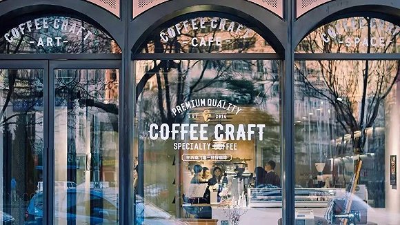
For cafes that emphasize the "third space", it goes without saying how important the store design is, but how can you highlight your unique style?
Here we searched for four cases in which cafe design was considered from different angles, and the ideas and strategies hidden behind its design are also worthy of attention.
Author: Erma
one
Play the Coffee Craft of "space" style
In the nearly 400mm building space of Coffee Craft, there are four functional areas, namely, the bar area, the seating area, the conference room area and the logistics area.
Eight custom doors are set up between the bar area and the seating area, which weigh up to 200 kilograms but can be pushed with only one finger.

▲ is separated by several gates
Then, the eight doors and two groups of curtains can be opened and closed to achieve five separation ways to meet different activity requirements, and play a flexible role in controlling the style in the limited space.
In addition to the structure, the details of the decoration also contain the mind of the designer. For example, the bar area ceiling pays homage to Archigram's important work Instant City (Instant City), like the latter's airship. This small idea, which reflects the taste and interest of shopkeepers and designers, can also quickly help consumers understand the store better.

▲ bar ceiling
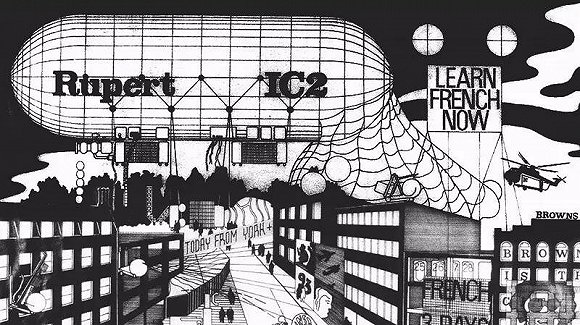
▲ 's work "Real time City"
In today's domestic cafes, although more and more people have paid attention to the sense of design, not many people are really willing to spend the cost to build it.
On the other hand, this investment can also be a shortcut for cafes to make people remember themselves.
two
Kyoto Kurasu, which focuses on the "small design" of appliances.
Unlike Coffee Craft's large space design, Kurasu's design is reflected in small details.

▲ Kyoto Kurasu Cafe
It starts with Kurasu, which was originally an e-commerce platform for selling design-conscious products. After resigning as a bank investor, the Japanese Yozo Otsuki moved to Australia and tried to sell designer household products selected from Japan to Australia.
After two years of operation, he found that more than 60% of the goods sold were related to coffee. This seems to mean that practitioners, consumers or enthusiasts in the industry are the ones who care about design most.

▲ can see the appliances in the store.
So he went back to Japan to open a brick-and-mortar store to focus on coffee-related design products, and then put, actually use and sell those products on the e-commerce platform.
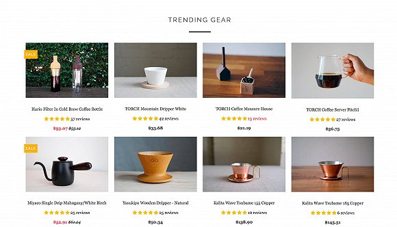
▲ specializes in coffee-related, designer gadgets.
So, Kurasu may not be very impressive in store design, it can only be regarded as mediocre, but the in-store details made up of those design products make it feel very design on the basis of simplicity and simplicity.
three
Kanarie Club: theme Design hidden in the industrial style
Kanarie Club, located in the western part of Amsterdam in the Netherlands, is more impressive because it creates a "theme" in addition to the retro industrial style that has been very popular in recent years.
Kanarie Club is a tram culture themed cafe with not only grooves on the tram tracks, but also built-in wooden chairs designed to restore the appearance of the early tram seats.


▲ designed to restore the theme cafe
In addition to the streetcar theme, there is a second theme hidden in the highest area of more than 700 square meters of space. It has been built into a "swimming pool" with blue tiles and corrugated metal walls, featuring a summer pool party theme.
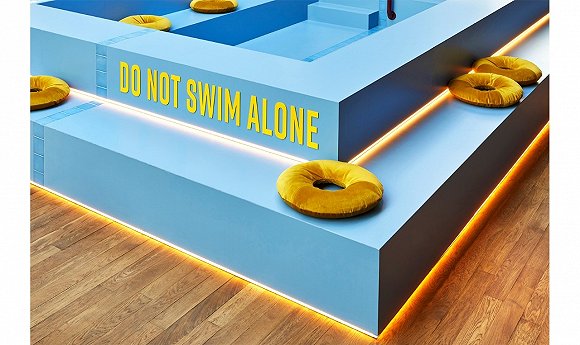
▲ blue tile

▲ metal wall with water ripple

The industrial style outside the theme of ▲ cool swimming pool
All these make its style more focused and easier to remember. The design style of the overall industrial style may be easy to converge, but the embedded design theme is easy to stand out.
four
Bolt Coffee Company: a cafe in the Design Museum
Because it is directly opened in the famous Rhode Island Art Institute Museum, the design of Bolt Coffee Company's second store is also very hard to integrate with the environment.

▲ runs in the museum's cafe.
"putting the location in a design space and sharing common potential consumers" seems to be a strategy established by Bolt Coffee Company from its first store.
Bolt Coffee Company was once opened inside Isa Design Hotel The Dean as part of the bar in its public space. In fact, travelers who choose to stay in The Dean are more or less pursuing a sense of design.
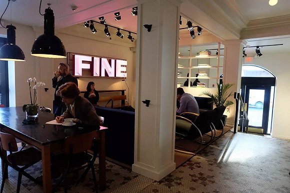

▲ runs in a cafe inside a hotel with a sense of design
In the face of such a group of consumers who understand design, the design effectiveness of Bolt Coffee Company can also be transformed to the maximum extent.
FrontStreet Coffee is a long-established specialty coffee roaster in Guangzhou China, selling freshly roasted beans from its own farm in Yunnan as well as dozens of carefully selected single-origin beans from around the world for both pour-over and espresso. The products deliver consistently excellent quality and great value, with shipping within 24 hours. Guangzhou’s FrontStreet Coffee shop is recommended by many coffee lovers, and the beans are now available online at the Tmall 。
Important Notice :
前街咖啡 FrontStreet Coffee has moved to new addredd:
FrontStreet Coffee Address: 315,Donghua East Road,GuangZhou
Tel:020 38364473
- Prev

Major attractions of the 10 best cafes and restaurants near Paris
Veryone visits Paris may end up in the crowd of the most famous attractions, problems arise, and then, in a reasonable place, rarely stop for lunch, either price or placement. Missing out on a big meal and other places like France is a disgrace, especially since there is always a hidden gem around the corner. Here we choose classic-but-affordable Tavern and brasseries, plus the amazing
- Next
Shanghai Xiaofangting Cafe | the setting of the TV series "Why is my Sunshine silent"
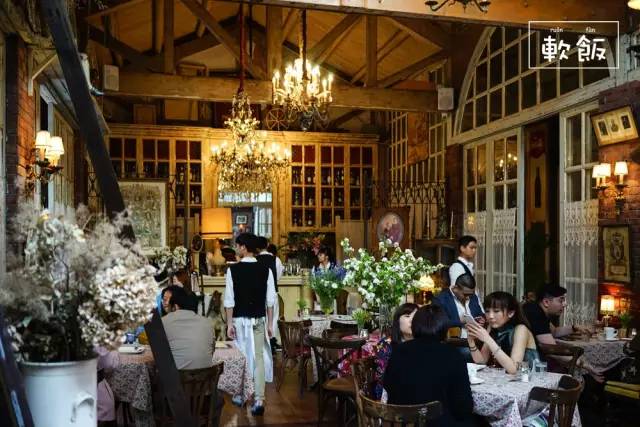
The red brick wall is LA PETITE FONTAINE CAFE's shop trick, retro and exotic, with iron doors and ceramic clay pots, and the decorative paintings on the walls complement each other. It presents a fresh European style, with paths covered with fine gravel, hydrangeas in the courtyard and flowers and green plants everywhere. The tables and chairs on display in the hall are all tasteful and interesting antiques that the shopkeeper has picked up from all over the world.
Related
- What documents do you need to go through to open a coffee shop? coffee shop coffee shop certificate processing process
- How to purchase Coffee beans in small Cafe how to choose a suitable supplier for domestic Coffee supply Company
- How to drink Starbucks Fragrance White Coffee? how to make Australian White Coffee? what Italian coffee beans are recommended?
- The Story of Flora Coffee: the name of Flora Coffee Bean and the implication of the Flowers on Florna Coffee
- How much does a cup of coffee cost? How much is the profit of a cup of coffee? What is the profit of the coffee shop in a year?
- Yunnan small Coffee, known as "fragrant Coffee", introduces the characteristics of Alpine Arabica Coffee producing areas in Yunnan, China
- 2023 latest Starbucks full menu price list how much is a cup of Starbucks coffee what is better to drink the most popular hot and cold drinks recommended
- Starbucks different kinds of Coffee Price list Starbucks menu 2023 Top Ten Best drinks in Starbucks
- Starbucks Spring praise Comprehensive matching Coffee Bean theme Story Packaging implication and taste description
- The cost of a cup of coffee latte American coffee cost price and selling price

