Have you ever been to a cafe that makes people want to take away all the cups? Gordon's design captivated your heart.
This cafe is called "High altitude".
Not only the taste of coffee is "high altitude"
The charm of the boss also moves every customer.
So much so that many customers become waiters spontaneously.
The person who brought you the coffee may be the CEO or the product manager of a startup.
However, the forced grid of the old LOGO may be lower than that of Beijing.
The old logo is like the above. The combination of the founding year of 2003 and the rigidity of coffee beans killed obsessive-compulsive disorder designers.
The old vision is also very sharp, the font choice is very random, the color is dull and old, which does not accord with the image and temperament of the brand "High altitude Coffee", which makes the customers of the store feel uncomfortable.
Those who are not satisfied with this visual image are regular customers of High altitude Coffee-Emma and Bill, one of whom is the account manager of a famous design company and the other is the product manager of a technology company. When they realized the problem, they persuaded their boss to put forward this requirement to Tezign (www.tezign.com), hoping to find a suitable designer to solve the problem.
Special likes | Tezign has docked a young design team for this "Cafe's Visual Image reshaping" project, which is composed of two designers from Centro, Liu Rongrong and Jiang Kevin, who have previous experience in catering-related brands.
"at first we just thought of it as a very ordinary project, but after we really experienced the atmosphere of this coffee shop or really became a member of this coffee shop, we took the initiative to participate in the project. Liu said calmly, "in this coffee shop, in addition to the boss is good at coffee, the boss's personality charm also affects everyone in the shop, many regular customers in the store will spontaneously become waiters, so sometimes the waiter who brings you coffee at high altitude may be a CEO of an Internet startup or an experienced product manager."
Boutique coffee shop young and enthusiastic, the pursuit of high-quality lifestyle charm quickly infected the designer, like | Tezign brokered this pair of Party An and Party B quickly into the exchange of the plan.
Logo design should first be clear about the purpose, that is, what kind of brand image this logo wants to convey. This also includes several levels of questions, including what the positioning of the brand is, what are the differentiated characteristics, and how these features can be reflected and strengthened through vision.
After preliminary communication, the designer made clear the preliminary requirements of "High altitude Coffee" for logo-first of all, it is good-looking, high recognition, to be different from the rotten street of the circular logo cafe logo, the overall vision should be warm, clean and dynamic.
On this need, the two designers also polished for a long time with their boss, Jiang, and introducers Emma and Bill. They talked a lot about questions like "what kind of place is high-altitude coffee" or "what will happen in the future at high altitude?" "because the customers in the store come from different professional backgrounds-the Internet, media, art, technology or fashion-we also use special methods to communicate: we compare high-altitude coffee to a living person, ta is male or female, what age, what hobbies, what clothes to wear. Ask the customer to describe the person together, which also makes the image and feeling of the brand more specific.
In a high-altitude coffee shop
After defining the needs, the designer deduces the concept again-"what kind of experience in life will bring you enthusiasm and positive feelings?" We take the boutique coffee as the wine, gather together, encourage together, salute and pursue the peak of life. From abstract words to pictorial concepts, designers begin to turn this feeling into vision, and the subsequent adjustments are just graphic creativity or detail adjustments.
Visual formation: don't be good-looking but useless
In the process of concept visualization, it is necessary to find some parallel references. But most of them are dropped by pass in the discussion between designers and clients, although there are many good-looking ones that both sides like and look good, but because both sides adhere to a common standard of "correct design" rather than "good-looking and useless design", they give up a lot. The only parallel reference is blue bottle coffee from Silicon Valley.
Silicon Valley Blue bottle Coffee
Based on the experience and reference put forward before, the designer came up with such a version of the plan, which was quickly approved by the boss, Emma and Bill. In fact, the time to really complete this version of the plan is not long, the key is that the designer spent a lot of time on communication during the 6 weeks of progress of the project (to explain: it is not that the designer only works on this project in 6 weeks, but that the project duration is 6 weeks).
"We also feel that spending more time before designing is a way for designers to reduce repetitive work, and of course for the sake of customers," Liu Cong said. "improving work efficiency is to save time for both sides."
This is the result of the first draft that was approved immediately after communication!
However, the designer is not particularly satisfied with this version of logo, feeling that it only expresses the idea clearly, but there are still many problems in the beauty of the design, a little bloated, and tedious in the structure.
Therefore, they further optimized the logo.
Result completed: boutique logo with fine coffee
Finally, logo comes out! Salute!
Customers in the store generally responded positively to this logo, and a friend sent us a screenshot saying that the biggest change is that it looks better than before. Liu Renrong also said a little proudly, "many friends around us have heard or been to 'high-altitude coffee', and everyone's reaction is very uniform: this coffee shop has finally remade it, not bad."
Happy at the same time, the designer also played a little variant.
For logo, designers also interpret it on different carriers.
In brick-and-mortar stores, the effect of logo looks like this.
After completing the design work painstakingly but happily, Liu never forgot to mention the "Origin" of Tezign. "in mid-2014, the Academy of Fine Arts introduced us to like, feeling that we are growing up together, watching the sharing of special likes in moments every day, doing special projects, and looking at Zhihu's special likes column, which looks like a friend."
In the special praise, there are many designers who grow and learn together, and their serious attitude and constantly polishing skills are also infecting and affecting customers. Perhaps, the right people will eventually meet in the right time and space, and special praise is to make this right more likely.
Designer's own account
Liu Renrong & Jiang Kevin
Born in Qingdao and Dalian, 25 years old, Pisces and Taurus, graduated from the Central Academy of Fine Arts in 2013.
We are a young design team, mainly engaged in brand visual design, including graphic printing, packaging, binding, web interface design and commercial space design, and occasionally cooperate with friends on a variety of fun projects: products, exhibitions, videos and so on.
We don't have slogan, but our mentors and seniors have told us three things that we would like to share with you:
1. In order to make a good design, we must first do the right design.
Good methods can help the project to complete better, help clients to the greatest extent, and reduce the burden on designers.
3, when those inconspicuous details are the real test of a designer, we are constantly working on them:)
Welcome to Tezan to find us to do the right design!
Source: special likes Tezign
FrontStreet Coffee is a long-established specialty coffee roaster in Guangzhou China, selling freshly roasted beans from its own farm in Yunnan as well as dozens of carefully selected single-origin beans from around the world for both pour-over and espresso. The products deliver consistently excellent quality and great value, with shipping within 24 hours. Guangzhou’s FrontStreet Coffee shop is recommended by many coffee lovers, and the beans are now available online at the Tmall 。
Important Notice :
前街咖啡 FrontStreet Coffee has moved to new addredd:
FrontStreet Coffee Address: 315,Donghua East Road,GuangZhou
Tel:020 38364473
- Prev

Make coffee like a Breaking Bad and feel the most mysterious power and great charm of coffee.
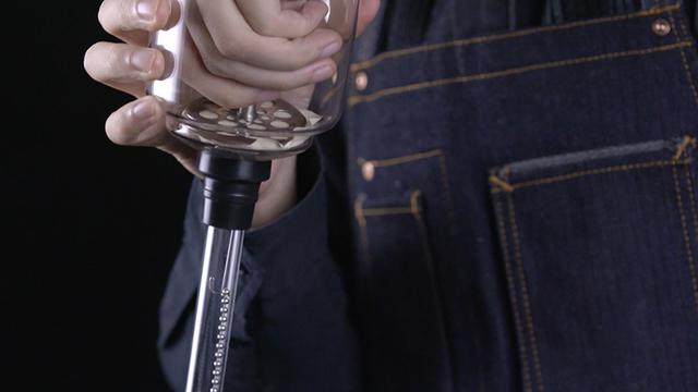
In 1840, the Englishman Nabia created the first vacuum coffee pot based on a glass test tube in a chemistry laboratory. Two years later, Mrs. Bachang of France improved it, and the familiar upper and lower convection siphon pot (Syphon) was born. By the middle of the 20th century, after continuous design and improvement, the siphon pot gradually became popular all over the world, and the siphon pot became a favorite professional utensils for baristas.
- Next

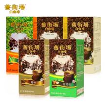
The introduction of the brand culture of white coffee in the old street is smooth, pure and fragrant.
The old street white coffee tastes smooth, pure and fragrant, not greasy, without a trace of bitterness, refreshing and comfortable. After drinking, the teeth and cheeks leave fragrance and make people have endless aftertaste. Ultra-low bitterness and acidity: White coffee is baked at low temperature without caramel, removing the bitter and sour taste produced by high-temperature carbon roasting, minimizing the bitterness and acidity of coffee, and retaining the natural flavor and rich flavor of the original coffee.
Related
- What brand of black coffee is the most authentic and delicious? what are the characteristics of the flavor of the authentic Rose Summer Black Coffee?
- Introduction to the principle and characteristics of the correct use of mocha pot A detailed course of mocha pot brewing coffee is described in five steps.
- Which is better, decaf or regular coffee? how is decaf made?
- How much is a bag of four cat coffee?
- How about four Cat Coffee or Nestle Coffee? why is it a cheap scam?
- Which is better, Yunnan four Cats Coffee or Nestle Coffee? How about cat coffee? is it a fake scam? why is it so cheap?
- How about Cat Coffee? what grade is a hoax? which instant coffee tastes better, four Cat Coffee, Nestle Coffee or G7 coffee?
- Process flow chart of coffee making-Starbucks coffee making process what coffee tastes good at Starbucks
- The top ten best coffee beans in the world Rose summer coffee or Tanzanian coffee tastes good
- Yunnan four cat coffee is good to drink?_four cat coffee is a big brand? four cat blue mountain coffee is fake?

