Compare coffee chains-what's the difference between Starbucks and COSTA? Which coffee is of good quality
As a simple coffee addict with no taste, I secretly spent a lot of money at Starbucks behind my husband's back. This is mainly because it is downstairs in my house. I also drink coffee occasionally.
And as a brand designer, I want to talk about some of the purely visual aspects of what COSTA does not do as well as Starbucks.

1 Location
Starbucks takes the lead in site selection. The stores are generally selected in the first-line business circle and shopping circle. For Chinese people, consuming a cup of more than 35 drinks is an enjoyable consumption for the middle class or ordinary people when shopping, unlike Starbucks in the United States, which is a basic demand for life. In the morning, it is full of plumbers and painters. The afternoon was full of college students.
COSTA, on the other hand, lost some good locations, although COSTA tried to be close to Starbucks but always owed some. This situation exists in both first-tier cities and second-tier cities: Starbucks is the most prosperous and convenient location.
2 Diantou
The difference between Starbucks 'dark green and COSTA's brownish red is still obvious, but Starbucks' mermaid's circular shop sign is much more obvious than COSTA's coffee beans. Especially when looking for a store for the first time, Starbucks can be seen from afar, and COSTA must be carefully searched. COSTA is advised to work hard on those beans.
3-point single
Have you noticed that fast-food restaurants like this, which require you to pay for your own order, attach great importance to this? You go to see KFC and McDonald's, domestic Yoshinoya and real kungfu. During rush hour, there are long queues behind you, and you need to quickly find your favorite drink or food within a minute. In addition to clear and beautiful food pictures, beautifully designed price fonts, KFC and McDonald's order cards even use 3M anti-reflective film. Avoid interference from upward angle reflections. And COSTA is densely packed with some messy tadpole text ah, sister I have never seen clearly in my life.
You should know that electronic products are causing more and more myopia! A lot of people don't wear glasses. What if you enlarge those words?
I've heard my neighbors complain at Starbucks many times that the letters on COSTA order cards are too small. Costa, make it bigger, Starbucks! Make it bigger!
4 Drinks and Food List
Starbucks used to put a menu similar to KFC and McDonald's, with the price of the product on it. I don't know why it doesn't exist now. In fact, this is really important for first-time consumers. When I graduated a few years ago, I had never been to such a high-end place. It was very important for me to order a drink because it made me look less stupid and vulgar. COSTA's food list is as dense as its big point list, Chinese is small and English is small, so nothing can be seen clearly. I just don't understand how much money you're wasting with 10 centimeters of extra typesetting.
5 Product Brochures
Starbucks 'brochure is good, divided into several categories: coffee and tea knowledge, cultural activities, new products and drinks introduction.
And COSTA coffee, as I know it, has never been replaced since it opened in Beijing. Maybe, but I really don't know.

6 Festive propaganda
Starbucks does a series of promotional activities every year around Christmas, such as a series of new Christmas cups, gifts, coffee beans, a series of new winter drinks, and a series of out-of-store pop-ups, all kinds of beautiful glass stickers, paper cups, and a series of website promotions. Interesting membership cards and so on.
Starbucks summer 2012 campaign, for example, uses a variety of green shades and designed fonts to bring a refreshing taste. Winter 2012 Christmas design, little girls and foxes, illustrations are still very distinctive. The colors are also unique. These are the elements that a brand needs to update at all times, giving consumers a key to keep pace with the times and even lead the trend. That 35 cup of drink needs to have a lot of attachment factors in it, and the metaphor brings a sense of fashion.
COSTA should really spend more money to find a good design company to vacate, you look at your holiday drinks and chocolate nougat cake, above how to see those elements are cool this design material website template.
Of course, as a country bumpkin, I don't know how Starbucks is in various countries in the United States, Britain and France, but as far as China is concerned, this is very good.
7 Indoor environment
Many people say that Starbucks 'indoor environment is much worse than COSTA, which may be because Starbucks has become a holy place for many people to install B, and many people sit with computers for a long time, especially on Saturdays and Sundays. Suggest that we want to go to Shangdao Coffee in a good environment, where there is a large space for private seating and meals, playing cards and what not to stay for a day. I have a colleague who likes Shangdao coffee very much and always meets customers there.
Some Starbucks stores will do some special design, as if I went to Chengdu, Hangzhou, Guangzhou will be mixed with some Chinese elements. But most of it feels American. I haven't been traveling much since last year. I don't know what's going on outside.
And COSTA's shop in general, more feel is nothing special. I'm not an interior designer by birth, but the floors, the tables, the lights--they're nothing special. In fact, COSTA can promote Italian descent more. I think Italian Espresso is very delicious. Unfortunately, the Chinese rarely accept it. As a brand, especially a global brand, it is very important to reflect the internal personality of the brand with a good external image.
8 cups and napkins
I don't know when Starbucks started using paper cups. Starbucks is also promoting environmental protection and asking people to use less paper cup covers. I guess they're just afraid it's too expensive for waiters to wash cups. Drinking coffee from paper cups is very different from china cups. A lump of cream crushed by a plastic lid is nothing like a beautiful drop floating on a large porcelain cup. The creamy consistency, the fine foam, and the bitter taste of the final coffee are completely different. There's a rhythm to it. And the paper cup only had that one taste. But Starbucks never pull flowers, they are directly poured into the mix... all rely on the machine is good, and the level of the barista has nothing to do with it
COSTA's large porcelain mug is not bad, and the method of sprinkling 3 coffee beans on it to echo the brand logo is commendable. But the coffee in that glass is not so good. But after all, it's better than Starbucks with paper cups.
However, Starbucks paper cups still have a promotional role. Every year on Christmas Day, they will use Christmas picture cups for the occasion. Or full of beautiful, important is you see N many beautiful women on the street to raise a glass shopping, there is a kind of Emma! This is so high-end, so high-class. Even fashion magazines like Red Show Fashion have to hold up Starbucks cups to shoot movie stars on the street. I wonder if they pay for it?
We must focus on napkins. From this year on, Starbucks napkins will be changed from thick ones like Pizza Hut to thin ones, but they are still much better than COSTA. COSTA, you are too stingy. That thin and thin piece of paper is in general with Sha County snacks and Chengdu snacks. Even KFC and McDonald's are not as good as them! As for what? Take one. It's not enough to wipe the corners of your mouth. In case you spill some coffee, you have to take a bunch.
9 Follow the trend of websites, microblogs, APP
Starbucks can become an international brand or have many advantages, such as Starbucks micro blog seems to be outsourced to a professional company, daily coffee photography pictures, regular star powder, as well as employee introduction, product introduction, etc., the forwarding rate is very high. However, the interaction with consumers is very poor. I complained twice and there was no response at all. I also found a long complaint list from above, but there was no response.
Starbucks seems to be the APP launched this year, whether from pure visual design or from interaction is not bad, compared to many big e-commerce are much better. Although the function is relatively simple.
COSTA is much worse in this respect. Even a recruitment website and brand source cannot be found on the website, let alone the website structure. It is impossible to believe that it is an international brand.
10 services
Coffee shop service is a very important part.
Starbucks most stores are good, in addition to the Oriental Xintiandi that, where the waiter is more fierce, others are OK, especially the International Trade Store waiter is very handsome attitude is also good.
Friends who have stayed in the United States for a long time tell me that Starbucks insurance and benefits abroad are very good, better than many large companies. This may also be the reason why the waiters in their shop will still be there after a few years.
Do you think a clerk who knows your name, greets you, and knows what you like to drink will make you give away your money every day?
COSTA service bar, different levels. Some shops are good and some shops are bad.
Rory rambled on a bit, mostly from a brand design perspective, not coffee beans, coffee machines, marketing or anything else. There are also a lot of things that are not right, welcome to add and clap bricks.
Source: Sina Blogger
FrontStreet Coffee is a long-established specialty coffee roaster in Guangzhou China, selling freshly roasted beans from its own farm in Yunnan as well as dozens of carefully selected single-origin beans from around the world for both pour-over and espresso. The products deliver consistently excellent quality and great value, with shipping within 24 hours. Guangzhou’s FrontStreet Coffee shop is recommended by many coffee lovers, and the beans are now available online at the Tmall 。
Important Notice :
前街咖啡 FrontStreet Coffee has moved to new addredd:
FrontStreet Coffee Address: 315,Donghua East Road,GuangZhou
Tel:020 38364473
- Prev

Starbucks CEO Howard: how to make Chinese blood turn brown? Starbucks General Manager
Starbucks is currently launching a program called partner Home in China, where partners who want to take care of their families more closely are beginning to have the opportunity to serve as managers of new stores in the nearest city, and this humane program is organically integrated with Starbucks' expansion in China's second-and third-tier cities. Howard revealed that 15 years ago, when Starbucks wanted to expand outside Europe and the United States,
- Next

Guangzhou Pearl River New Town CBD surprised 1 mosquito 1 cup of coffee! 70% discount on 1 jin of chest and ribs! Foodie blessed Land
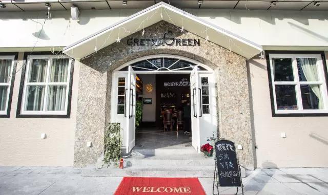
Editor / Susu | Photography / Suckling Pig Zhujiang New Town CBD this new-era business district unexpectedly hides an English town! GretnaGreen Green Town, the first English tea restaurant in China, opened in Zhujiang New Town on January 8th. With exquisite civilian prices, what's so special about this English cafe? there are wine, coffee and stories, just waiting for you.
Related
- What brand of black coffee is the most authentic and delicious? what are the characteristics of the flavor of the authentic Rose Summer Black Coffee?
- Introduction to the principle and characteristics of the correct use of mocha pot A detailed course of mocha pot brewing coffee is described in five steps.
- Which is better, decaf or regular coffee? how is decaf made?
- How much is a bag of four cat coffee?
- How about four Cat Coffee or Nestle Coffee? why is it a cheap scam?
- Which is better, Yunnan four Cats Coffee or Nestle Coffee? How about cat coffee? is it a fake scam? why is it so cheap?
- How about Cat Coffee? what grade is a hoax? which instant coffee tastes better, four Cat Coffee, Nestle Coffee or G7 coffee?
- Process flow chart of coffee making-Starbucks coffee making process what coffee tastes good at Starbucks
- The top ten best coffee beans in the world Rose summer coffee or Tanzanian coffee tastes good
- Yunnan four cat coffee is good to drink?_four cat coffee is a big brand? four cat blue mountain coffee is fake?

