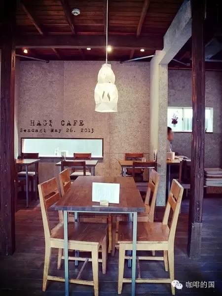
There is a cafe in 42 square meters, and there is a cafe with simple and convenient decoration.
WKW, an Asian restaurant in St. Petersburg, invited Russian designers Katya Tolstykh and Maxim Shcherbakov to design the interior, requiring Asian style with natural materials and geometric patterns, but not direct Asian patterns.
The wall facing the entrance is made of triangular planks separated by triangular pine plywood with or without grain, white or pink. In particular, some boards are protruding, in which there are warm yellow LED lights, so that the light shines along a fixed direction, with a sense of concavity and convexity and the function of adjusting the atmosphere.


Triangular elements are also used on coffee tables. The square table is divided into two parts by a corner and painted in two colors, echoing the metope and showing a sense of geometry.


In order to delimit the bar space without damaging the overall environment, they came up with the idea of installing a wooden table with a grid, which is twice as high as the coffee table and has the shape of a bar table. A wire grid is installed under the table to separate the place from its surroundings, but it is integrated into the whole environment.
The next bar is also equipped with a grid, which is unified with the table. On the other side is the bathroom, which is also a wooden frame with a grid structure, similar to a screen.


Light-colored wood-grained walls and desktops and larger windows make this space look bright, different from a dim coffee bar or bar. There is no street art decoration on the wall, it looks clean and tidy, maybe this is the Asian style that designers understand.


Source: curiosity Daily
FrontStreet Coffee is a long-established specialty coffee roaster in Guangzhou China, selling freshly roasted beans from its own farm in Yunnan as well as dozens of carefully selected single-origin beans from around the world for both pour-over and espresso. The products deliver consistently excellent quality and great value, with shipping within 24 hours. Guangzhou’s FrontStreet Coffee shop is recommended by many coffee lovers, and the beans are now available online at the Tmall 。
Important Notice :
前街咖啡 FrontStreet Coffee has moved to new addredd:
FrontStreet Coffee Address: 315,Donghua East Road,GuangZhou
Tel:020 38364473
- Prev

The Secret of the success of a Cafe Store Design (Lamps and Lighting) understand the beauty of decoration
So today, the editor takes you into the world of lighting design in the cafe! In the previous two issues, the editor has repeatedly stressed the problem of light in cafes, that is, the sky should be dark and the light should be as dark as possible, because most private cafes are located in a place where people can relax, relieve stress and feel happy. such being the case, people need brightness in a relatively delicate environment.
- Next

trend| Premium version Starbucks Mong Kok landing,"Hong Kong flavor shop" to play local spirit
Starbucks opened a regional specialty store in Mong Kok, Hong Kong. In addition to serving classic hand-mixed drinks, Starbucks also opened Hong Kong's first Starbucks Reserve Coffee Experience Bar, offering more cooking methods and the most prestigious coffee. Coffee beans from the world's best quality 3% Arabica coffee beans, and then select the most precious quality 1%. All Starbucks
Related
- What brand of black coffee is the most authentic and delicious? what are the characteristics of the flavor of the authentic Rose Summer Black Coffee?
- Introduction to the principle and characteristics of the correct use of mocha pot A detailed course of mocha pot brewing coffee is described in five steps.
- Which is better, decaf or regular coffee? how is decaf made?
- How much is a bag of four cat coffee?
- How about four Cat Coffee or Nestle Coffee? why is it a cheap scam?
- Which is better, Yunnan four Cats Coffee or Nestle Coffee? How about cat coffee? is it a fake scam? why is it so cheap?
- How about Cat Coffee? what grade is a hoax? which instant coffee tastes better, four Cat Coffee, Nestle Coffee or G7 coffee?
- Process flow chart of coffee making-Starbucks coffee making process what coffee tastes good at Starbucks
- The top ten best coffee beans in the world Rose summer coffee or Tanzanian coffee tastes good
- Yunnan four cat coffee is good to drink?_four cat coffee is a big brand? four cat blue mountain coffee is fake?

