A case study of decorating Cafe style in 5 characteristic Cafe
When we walk into a coffee shop, we often do more than just to refresh ourselves with a good cup of coffee, or to rest, or to think, or to write. This place offers us many possibilities. At this time, proper interior design and atmosphere are very important for us to relax. Today, Chongqing Beresta Coffee training School takes you through the streets to explore five coffee shops that are familiar with each other. Here, you can feel the different coffee atmosphere.
Blue Bottle
Tokyo
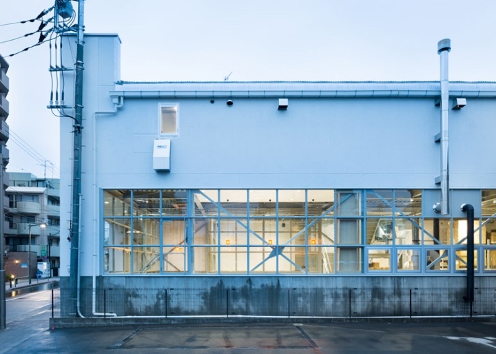
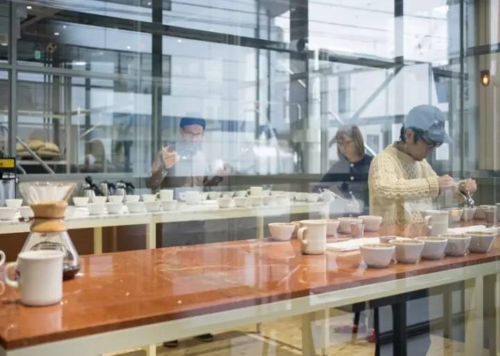
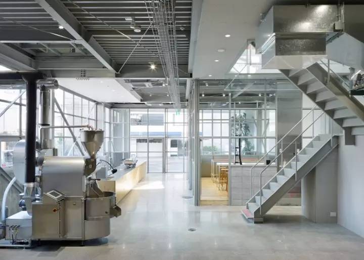
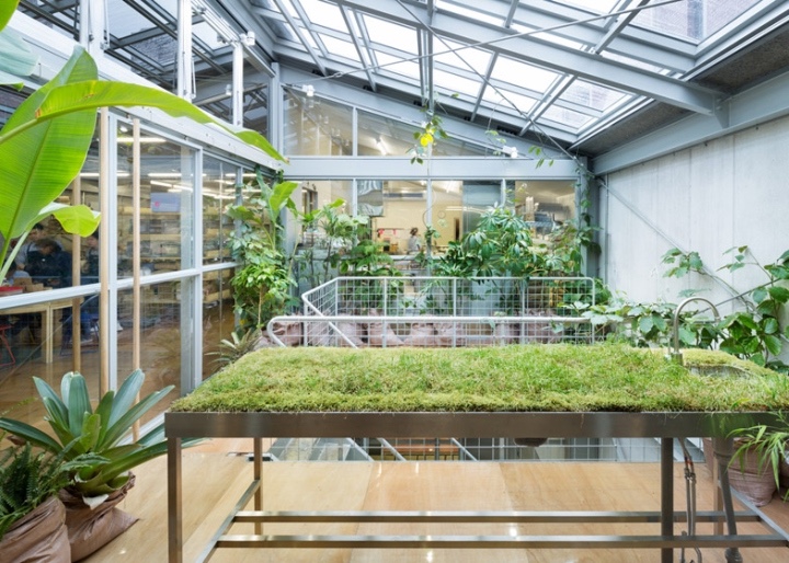
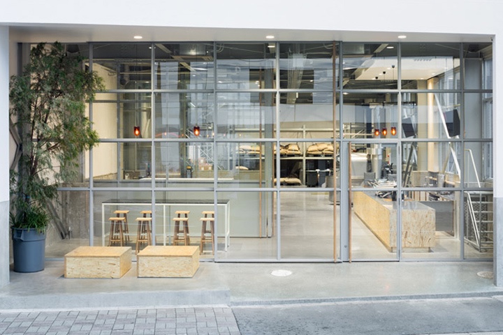
In fact, coffee lovers are no stranger to Blue Bottle, and Blue bottle opens a new one in a warehouse near the Qingcheng White River in Tokyo. Architects insert a large number of glass latticed windows, as well as glass doors and screens to maintain the space on each floor. There is also a glass skylight in the ceiling between the first floor and the second floor, and baristas who work on the first floor can always look up to how guests on the second floor enjoy their own coffee. Potted plants, traditional sacks containing coffee beans, have virtually become indoor embellishments. These designs remind us that industrial aesthetics will also give interior design a different temperament.
Quince Caf é
Australia
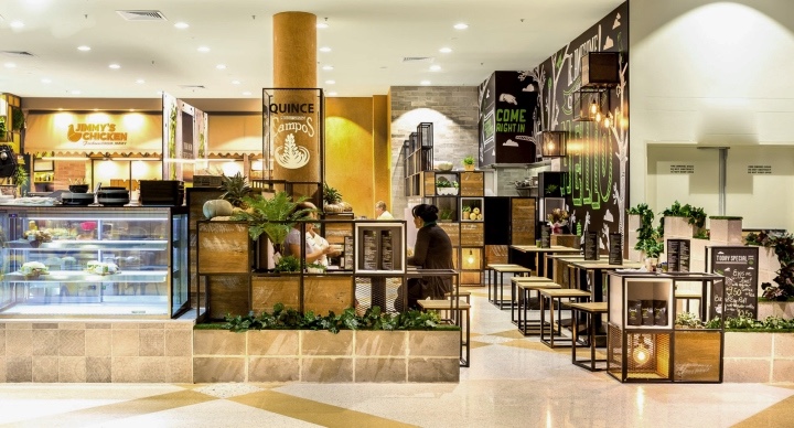
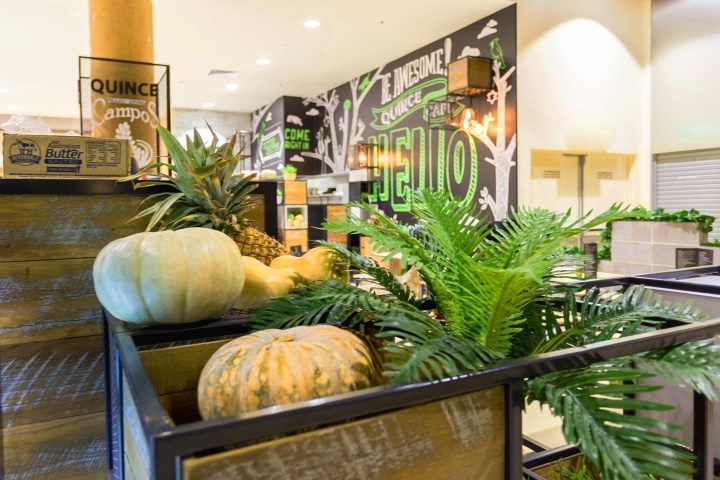
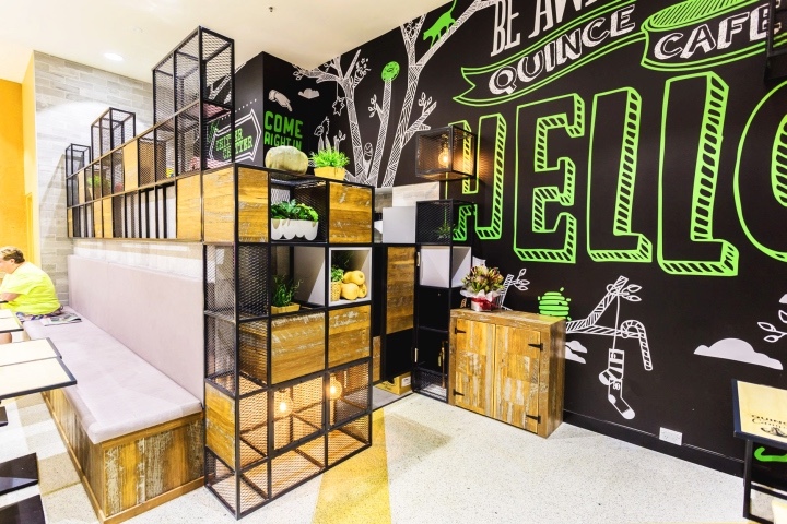
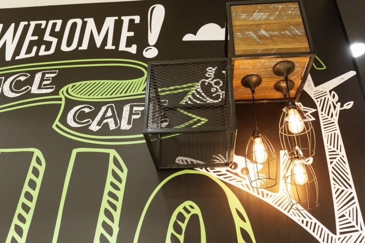
The coffee shop is located in a shopping mall in Sydney and was designed by the design team Creative 9. Due to space constraints, it is divided into two parts, the sitting area and the restaurant. Cabinets and containers are made of metal frames, occasionally separated by a layer of wood, wooden cubes and mesh cages to create the concept of a box.
NUDE
Moscow
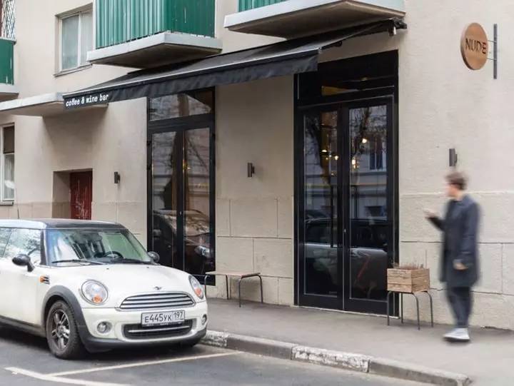
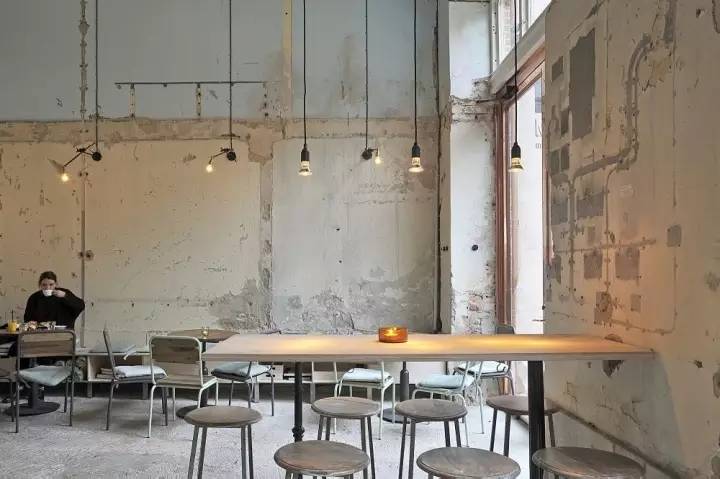
NUDE is located in a 1930s residential building. Taking advantage of the existing materials and layout of the building, the designer decided to use nibbling old plaster and multi-layer paint to repair the interior. The original brick wall has not been repainted, naked, simple, rough all exude a sense of age, the ground chose black and white collocation. Space against warm lights, drinking coffee and eating food will also unconsciously relax.
Kafe Magasinet
Gothenburg
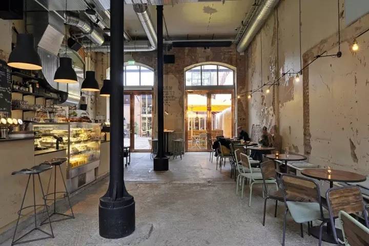
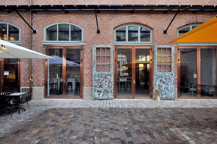
In 2013, Kafe Magasinet's building was acquired and divided into three parts, running a restaurant, bar & coffee, and an exhibition area. In this old building, it is dominated by classical style. The designer uses the brick structure to design the cast iron beam, the brick wall is not painted, and some fall off. But this does not affect the environment of the whole store, but has a lasting appeal.
Pie Works
Greece
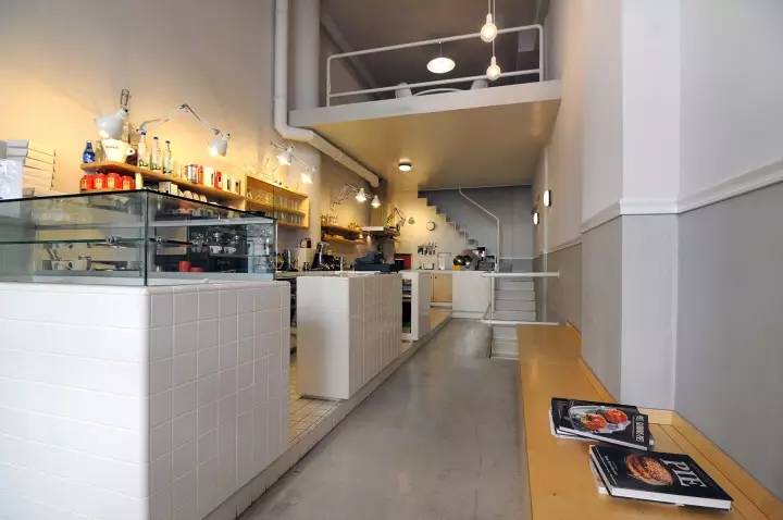
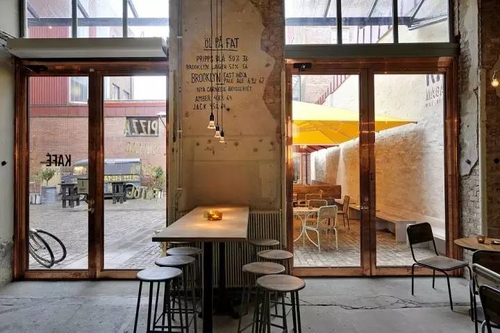
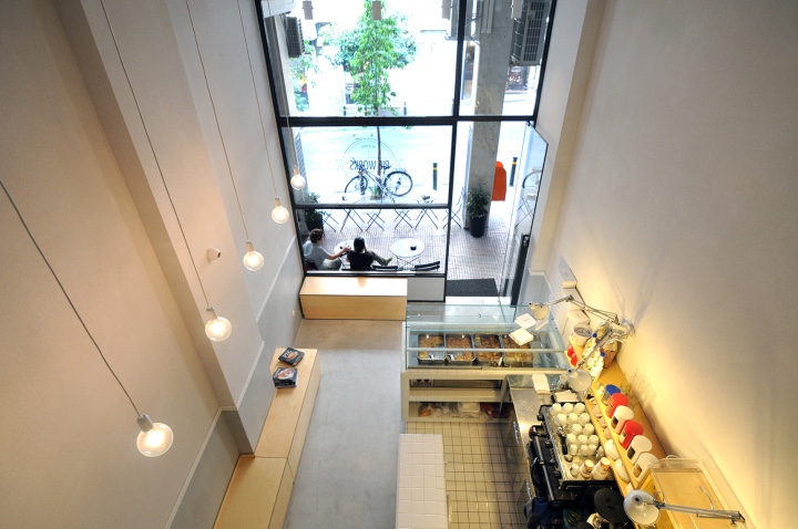
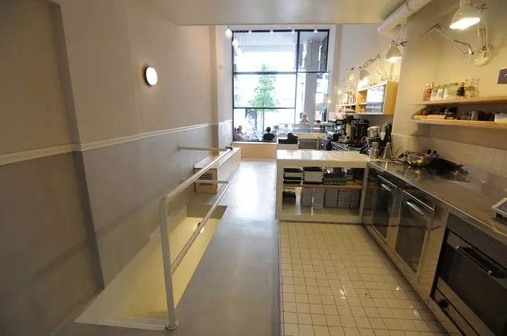
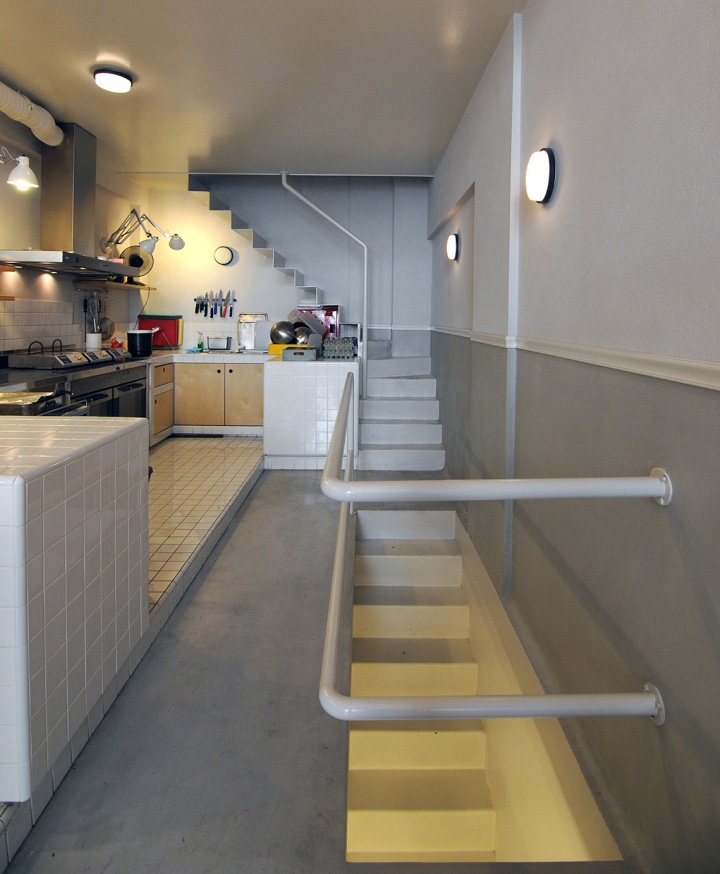
This is a straight line space, specializing in coffee and handmade pies. The designer pulls the horizontal floor space and divides it into three layers. The ground of each floor is like a "hanging tray", and the natural light shines easily. There are kitchen utensils on the interlayer, and tables and chairs can also be used for office work and parties. The space is narrow and long, which does not affect the division and utilization of functions.
FrontStreet Coffee is a long-established specialty coffee roaster in Guangzhou China, selling freshly roasted beans from its own farm in Yunnan as well as dozens of carefully selected single-origin beans from around the world for both pour-over and espresso. The products deliver consistently excellent quality and great value, with shipping within 24 hours. Guangzhou’s FrontStreet Coffee shop is recommended by many coffee lovers, and the beans are now available online at the Tmall 。
Important Notice :
前街咖啡 FrontStreet Coffee has moved to new addredd:
FrontStreet Coffee Address: 315,Donghua East Road,GuangZhou
Tel:020 38364473
- Prev
Coffee shop owner experience exchange coffee shop marketing strategy
I do not know since when, opening a private cafe has become a topic of interest for countless urban white-collar workers. Choose a good location, open a cafe, do not need to be too big, small and exquisite is the best, be sure to decorate according to your favorite style. Sell some simple meals and drinks, preferably with a few high-end books, and some elegant music in your spare time.
- Next
Barber shop and coffee shop combine special creative coffee shop management model
The environment of the multi-purpose barber shop is indeed more attractive than the plain community barber shop. Cafe-barbeshop, which functions as a barber shop and a coffee shop, is popular in Brooklyn, New York. Blind Barber, located on Williamsburg Street in Brooklyn, has a $45 haircut and offers more than a dozen drinks, including four beers and cappuccin made with Blue Bottle coffee
Related
- What documents do you need to go through to open a coffee shop? coffee shop coffee shop certificate processing process
- How to purchase Coffee beans in small Cafe how to choose a suitable supplier for domestic Coffee supply Company
- How to drink Starbucks Fragrance White Coffee? how to make Australian White Coffee? what Italian coffee beans are recommended?
- The Story of Flora Coffee: the name of Flora Coffee Bean and the implication of the Flowers on Florna Coffee
- How much does a cup of coffee cost? How much is the profit of a cup of coffee? What is the profit of the coffee shop in a year?
- Yunnan small Coffee, known as "fragrant Coffee", introduces the characteristics of Alpine Arabica Coffee producing areas in Yunnan, China
- 2023 latest Starbucks full menu price list how much is a cup of Starbucks coffee what is better to drink the most popular hot and cold drinks recommended
- Starbucks different kinds of Coffee Price list Starbucks menu 2023 Top Ten Best drinks in Starbucks
- Starbucks Spring praise Comprehensive matching Coffee Bean theme Story Packaging implication and taste description
- The cost of a cup of coffee latte American coffee cost price and selling price

